Sage, Cream, Aubergine?! The Surprising Color Combos Taking Over Interiors this Season

Eggplant walls? Now that *is* groundbreaking

PureWow editors select every item that appears on this page, and some items may be gifted to us. Additionally, PureWow may earn compensation through affiliate links within the story. All prices are accurate upon date of publish. You can learn more about the affiliate process here.

dark purple, moody blue and pink rooms
Loloi/Anthropologie/Magnolia

As a longtime home editor, I’ve become accustomed to the pendulum swing of color trends: We love light, bright and airy—especially in the spring and summer—until it starts to feel stark. Then, those cool tones are replaced by something warmer. (In 2011, it was shocking to say “gray is the new beige” until it became mainstream. Now, millennial gray has been deemed overdone and dreary, and taupe and beige are back.)

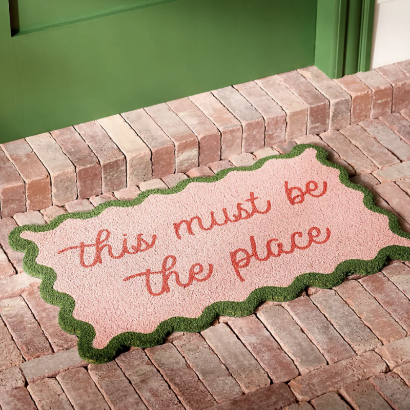
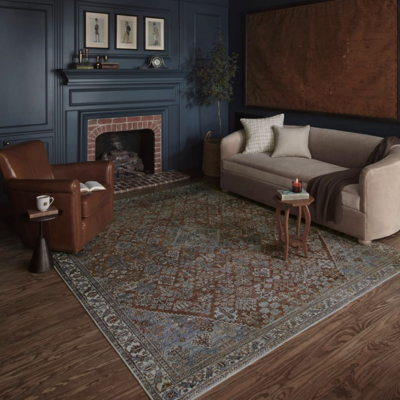
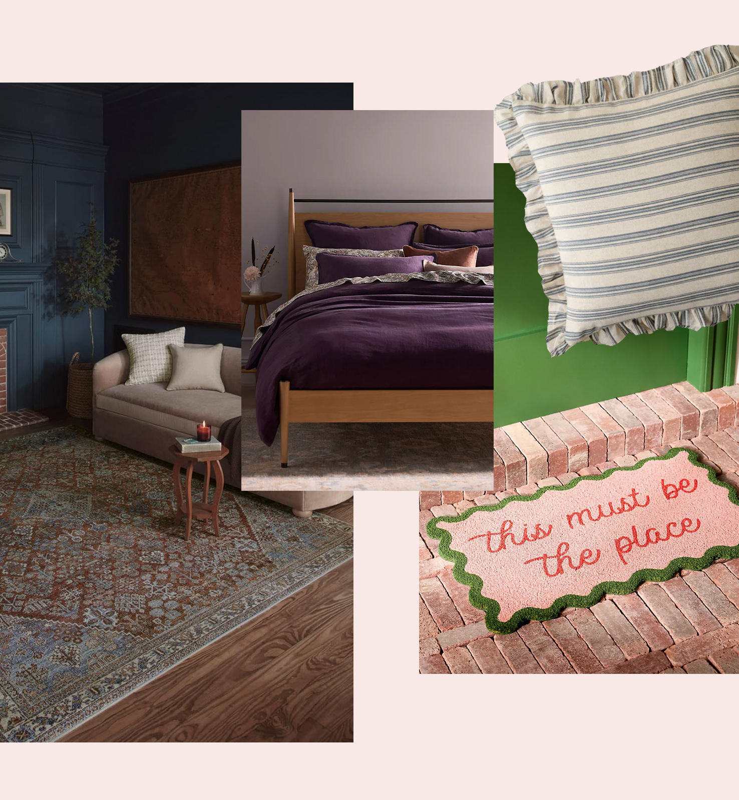
But there are always a few outliers; unexpected trends that start to take off and offer a refreshing contrast to the sea of similar, play-it-safe rooms. Especially in 2026. After a push toward minimalism gave way to maximalism, we’re landing somewhere in between (which some are dubbing "midimalism”), but more importantly, we’re less interested in decorating for outward validation or ROI. The “My room, my rules” movement has taken hold, where expressing who you are is more powerful than ever.

After researching the market, speaking to designers and color experts, and poring over Google, Etsy and Pinterest Trend Report data, I’ve noticed a few striking color combinations gain steam this year. Some are bold, some soothing—but all make a statement.

1. Aubergine & Ochre

Maybe it’s the Wuthering Heights effect, or a carryover from the Dark Academia aesthetic, but eggplant is having a moment in interior design. (Pinterest reports searches for aubergine kitchens are up 495 percent this year, though that dark purple hue can be just as powerful in a bedroom or powder room.) The color creates a cocooning environment, but it can easily turn cave-like, which is why it’s often being paired with bright golden tones, like ochre. Glossy aubergine tiles help reflect light, as does the sheen from velvet, inviting you to play with textures to liven up the room.

2. Sage & Cream

All-white kitchens may be on the decline, but for people who like brighter spaces, the key is opting for softer, warmer neutrals, like cream. Combine that with light wood and sage tones, and you have a space that still feels light and laid-back, yet refined and inviting. It’s a natural extension of the biophilic design trends we’ve been seeing over the past few years and lets you refresh your space without undergoing a massive (and potentially jarring) overhaul.

3. Fuchsia, Millennial Pink and Green

Wait, wait, wait—millennial pink is back? Already? Social media has made trend cycles spin faster than ever, and for many, the color never disappeared. Color experts at Valspar and HGTV Home by Sherwin-Williams predict that pinks and green will come back in a huge way, as the colors extend from fashion and pop culture to interior design. This time around, pale pink is the neutral—not the pop of color that it was a decade ago—helping ground bolder fuchsias and greens. Throw in a creamy white for good measure, so your senses aren’t overwhelmed, and you’ve got a preppy, Palm Beachy vibe that’s an instant dopamine hit.

4. Moody Blue and Warm Wood

If you’re into quiet luxury but all-beige everything isn’t your style, consider this rich color combination. Flashes of bronze or copper amp up the warm wood tones and keep the dark, moody blue from skewing too dark. That said, this combination works best in rooms with dimmable lighting—or, even better, plenty of natural light.

5. Dusty Blue & Beige

Blue and white is a timeless color combination, but lately, it’s been getting a warmer shift. Joanna Gaines’s spring collection featured plenty of dusty blue items, a throughline that extends to her summer collection, with its chambray runners and napkins (among other pieces). Instead of a crisp white, it’s being paired with more mellow neutrals, like oatmeal and beige.


candace davison bio

Candace Davison

VP of editorial content

  • Oversees home, food and commerce articles
  • Author of two cookbooks and has contributed recipes to three others
  • Named one of 2023's Outstanding Young Alumni at the University of South Florida, where she studied mass communications and business