You’ve heard that putting up your Christmas decorations early can make you feel happier, but what about ushering in spring a little ahead of schedule? According to room color psychology, the colors in your home can play a huge part in your daily feelings and emotions, especially while you’re spending so much time indoors (thanks, WFH).
So why not flip your home—and your mood—ASAP? If you’re looking for a lighter, brighter, more energized 2023, these are the hottest spring colors to choose from, all paired with interior designer Tina Ramchandani’s tips for making them work in your space.
11 Spring Colors That’ll Liven Up Your Home (Without Making It Look Like an Easter Egg)

•
Published Mar 10, 2023
PureWow editors select every item that appears on this page, and some items may be gifted to us. Additionally, PureWow may earn compensation through affiliate links within the story. All prices are accurate upon date of publish. You can learn more about the affiliate process here.
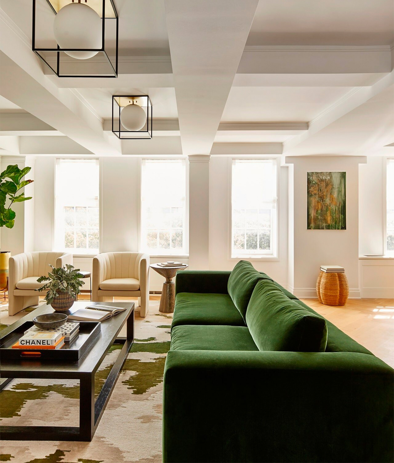
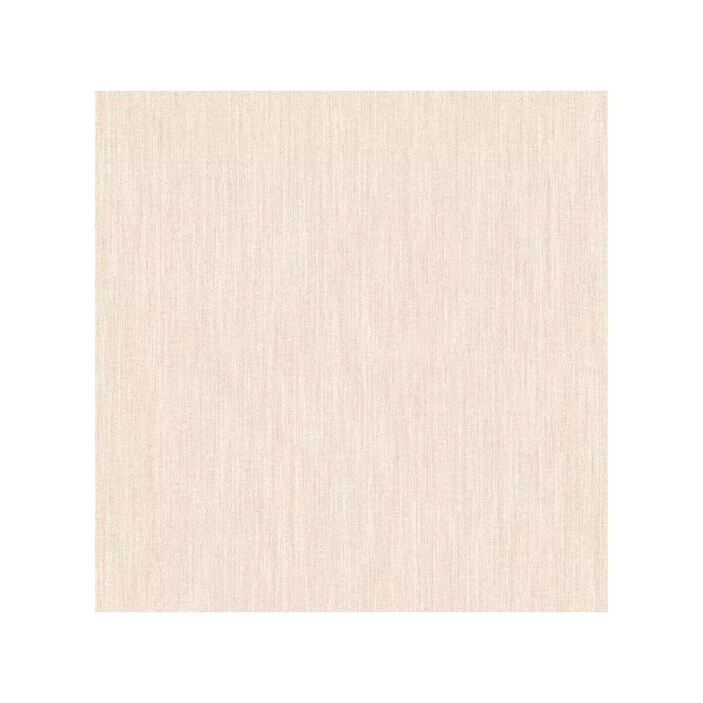
If Your Room Is A Mix Of Earth Tones, Try…
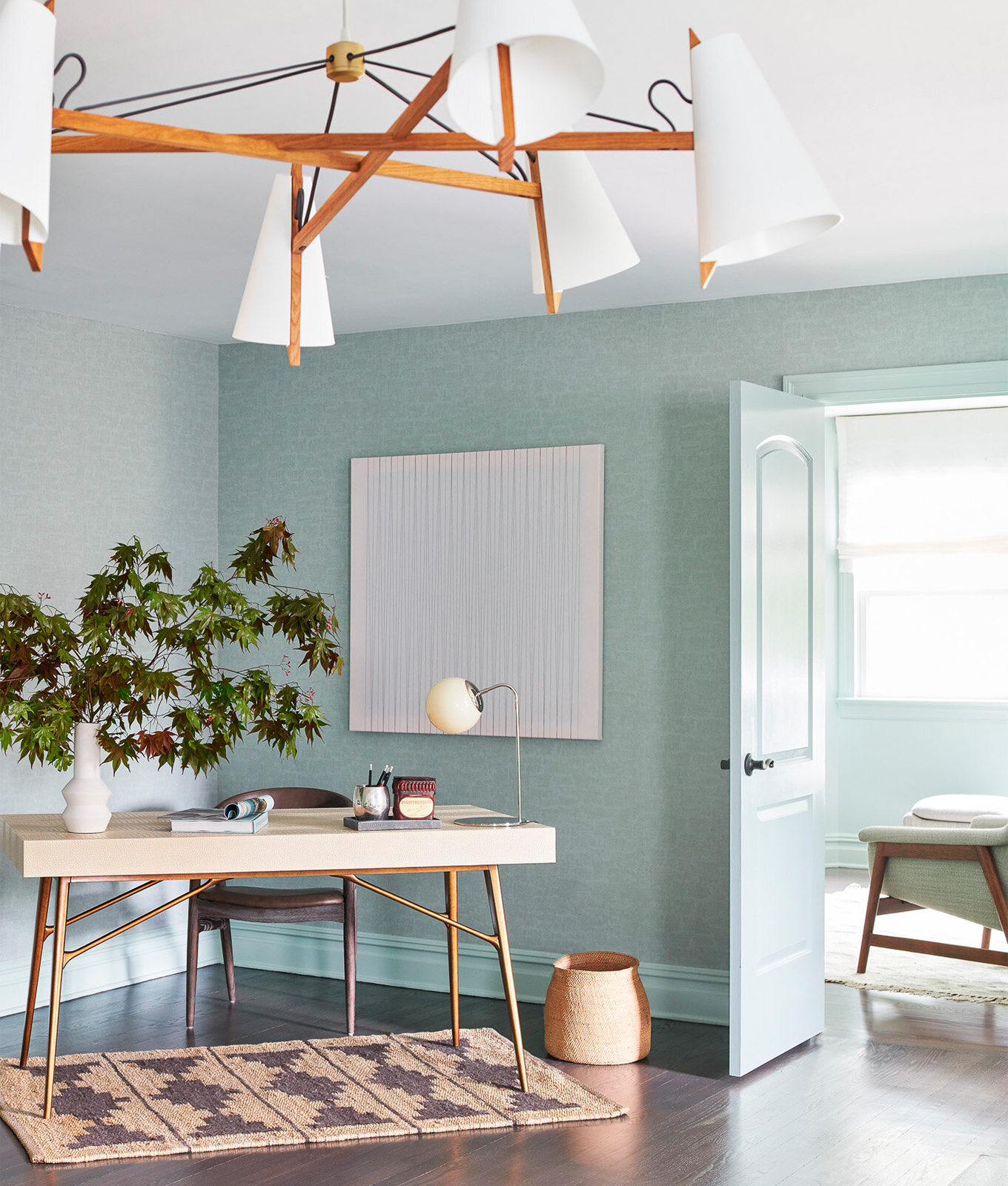
LISA RUSSMAN COURTESY OF TINA RAMCHANDANI
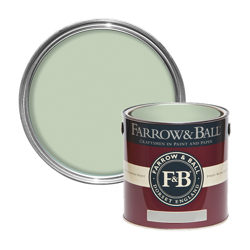
1. Pistachio or Dark Mint Green
Choosing spring colors can be tricky, but if there’s one color that’s been a repeat request from Ramchandani’s clients, it’s green (surprise, surprise). It’s a dark minty green, to be exact, and since we’re seeing pistachio take over the fashion world as well, it really makes sense.
“It's deep enough to feel safe,” the designer notes, “but it's still an exciting additional color to otherwise neutral spaces.” So, if you tend to favor neutrals, this is a great place to start. Not only is it chic when paired with your go-to ivories, browns and grays, but these muted greens can be enhanced even further with different green hues and other cool tones. It’s exactly the color all those natural furniture pieces of yours are begging to invite over.
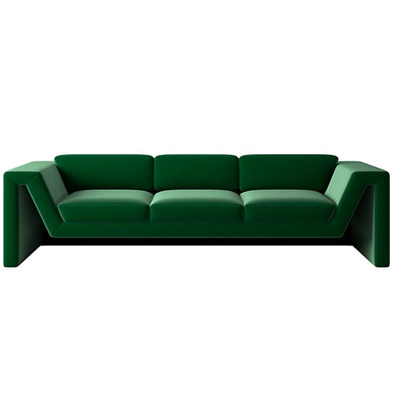
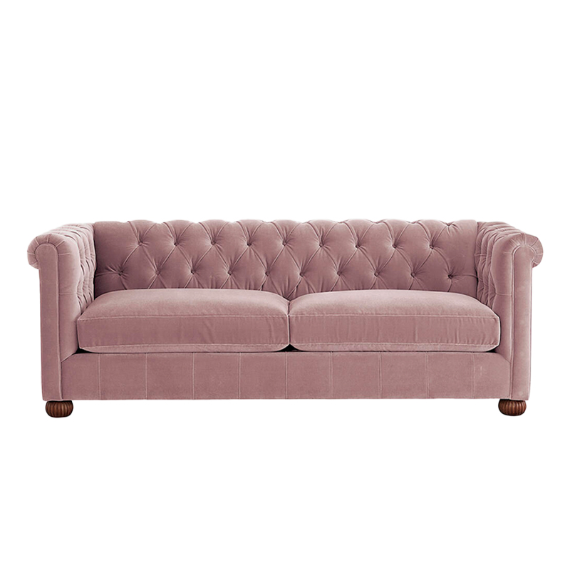
JACOB SNAVELY COURTESY OF TINA RAMCHANDANI
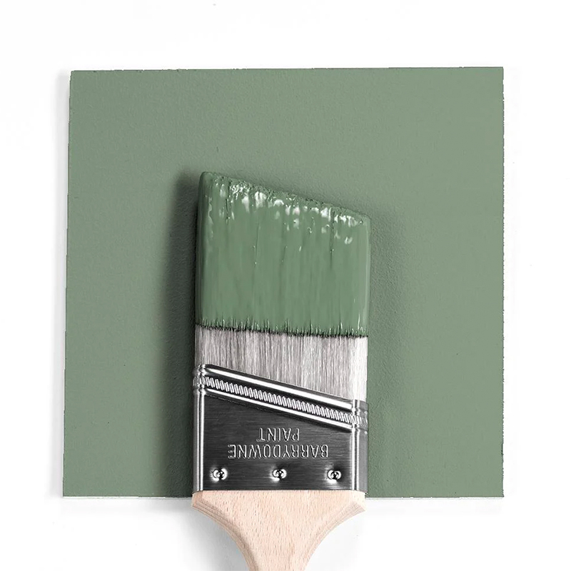
2. Kelly Green
Sticking with this year’s obsession with green, Kelly Green is exactly the burst of vibrance you need bring the outdoors in—and if that’s not the perfect way to usher in the season’s blooms, we don’t know what is.
It’s a classic color that never goes out of style and can easily elevate a space just by existing in its sophisticated glory. Plus, per Ramchandani, you can incorporate the color in your furniture/decor (instead of committing to Kelly green walls): “Instead of going totally trendy with the design, [pick a few Kelly green] moments—like with [the sofa shown above]—and kept the rest of the pieces timeless.” Either way, whether you’re adding it to your walls, your statement sofa, pillows, curtains, throw blankets—you name it, this elegant green makes the perfect addition to already-earthy spaces (read: Organic Modern design).
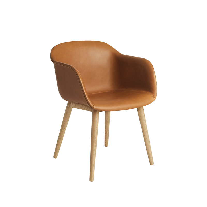
Shop The Look
If Your Home Is All Rustic, Everywhere, Try…
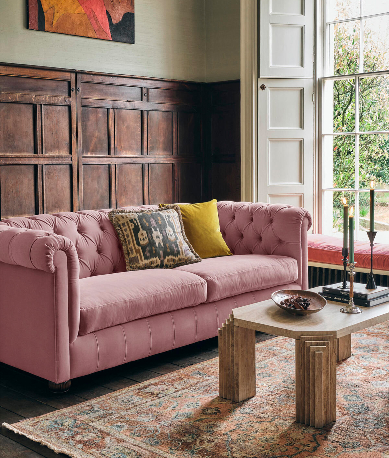
SOHO HOME
3. Blush Pink
For anyone who’s nervous about introducing their neutral-hued home to the world of color, Ramchandani recommends working with pops of softer or darker-toned colors, like soft pinks or mauve to make the transition gradual.
While you can, of course, mix and match a variety of other colors, blush pink is almost always a foolproof option—especially for spring. After all, there’s a reason light pinks, specifically, are considered a non-neutral neutral in interior design, since they can so often replace creams and beiges and make other colors glow in the process. Invest in smaller items like soft pink pillows and multi-colored art if you’re feeling intimidated.
Shop The Look
If Your Home Features Mostly Warm Neutrals, Try…
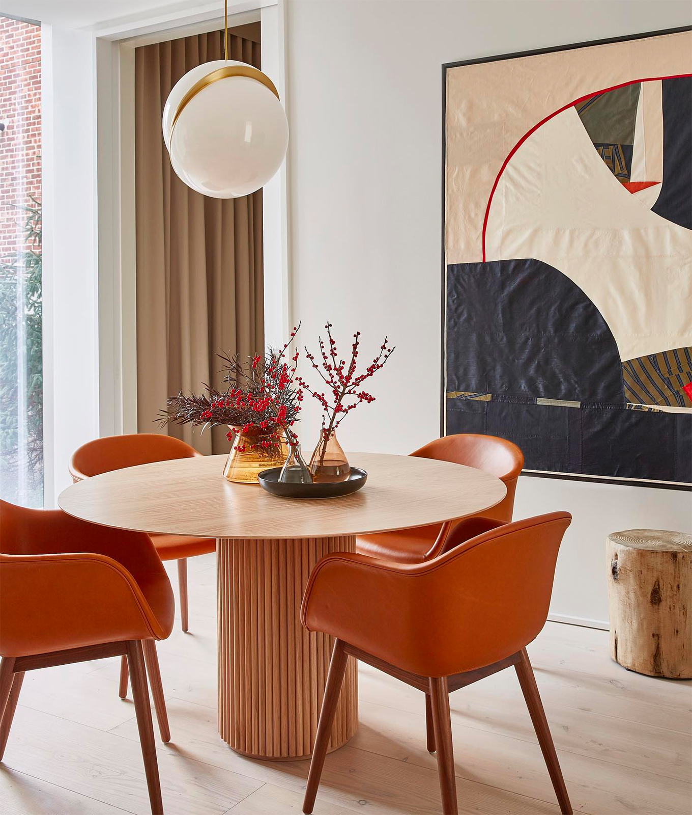
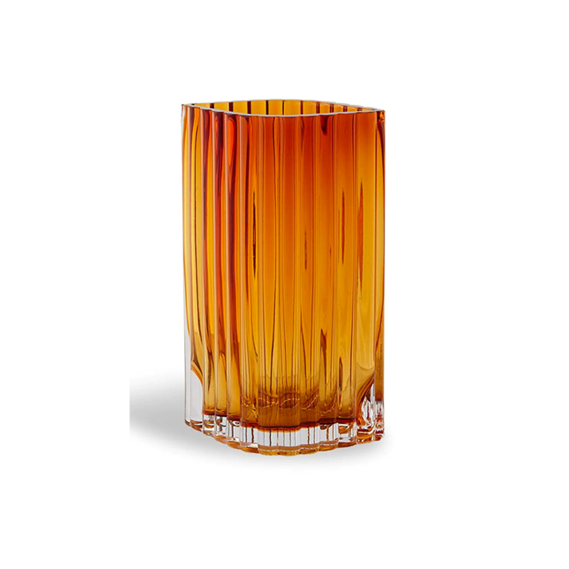
JACOB SNAVELY COURTESY OF TINA RAMCHANDANI
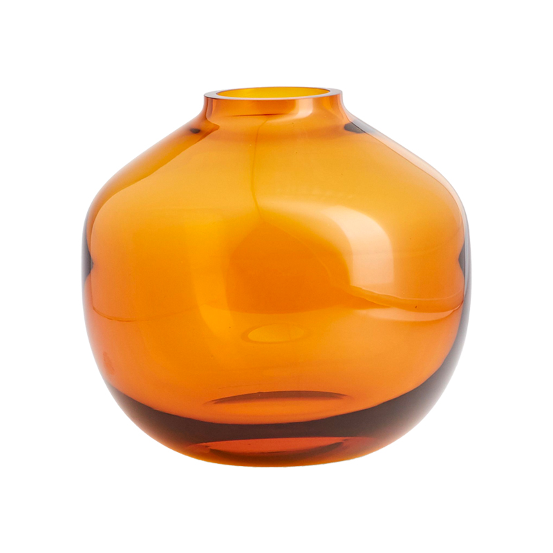
4. Terracotta
Orange may not be in your typical color palette, but Terracotta will make you reconsider. It’s the perfect touch of orange that’ll ease you out of your comfort zone and into a whole new realm of color possibilities (and who knows what doors that’ll open IRL). The richness is styled best alongside warm accents like brown, cream and ivory for the perfect slice of desert-inspired paradise. If you typically run toward neutrals but want to add a little something extra, let your favorite terracotta planters inspire you to have a little fun with your decor.
Shop The Look
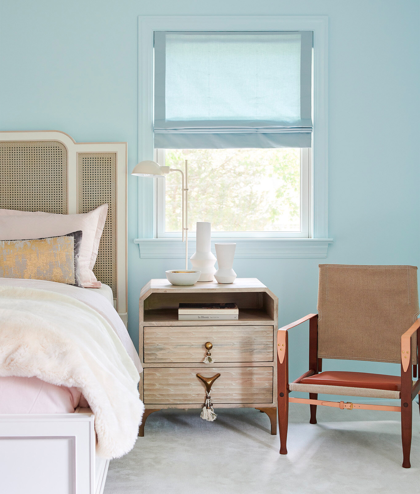
LISA RUSSMAN COURTESY OF TINA RAMCHANDANI
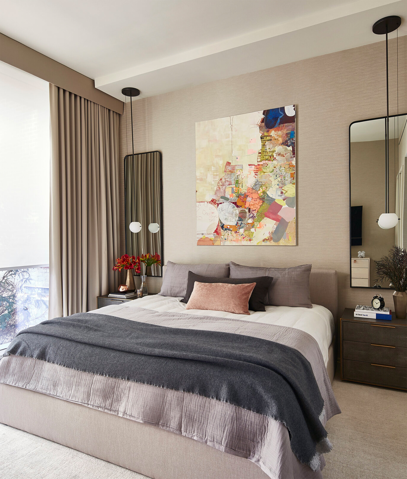
5. Sky Blue
Keeping with the vacation vibes, mixing pale blues with your natural wood furniture and warm neutral walls will give you the beachy vibe of your dreams. Of course, incorporating colors like sky blue doesn’t mean you have to change your wall color. Try a rug, if you’d like a more temporary option. “Because rugs take up the majority of the floor space, they can be used to enhance your space in really interesting ways,” Tina highlights. And by the same token, you can also bring the color into your window treatments (like Ramchandani did above) as another easily swappable alternative.
Bright pillows with light blue patterns, soft throw blankets or even peel-and-stick wallpaper, are also great (and often less expensive) options for temporary changes that’ll make a world of a difference in your space.
6. Buttercup Yellow
Naturally, bright yellow will breathe lots of energy into a room, making it the perfect addition to an at-home office or study space, particularly those that already incorporate warm neutrals. If you’re going for a softer yellow, feel free to play around with tertiary colors that have the same intensity as light yellow since, like pale pink, it’s ideal for mixing and matching. Consider pale yellow rugs, knickknacks, or art to tie everything together in a natural way without feeling like you’re in a field of dandelions (unless you’re into that).
If Your Room Has Black Or Grey Tones, Try…
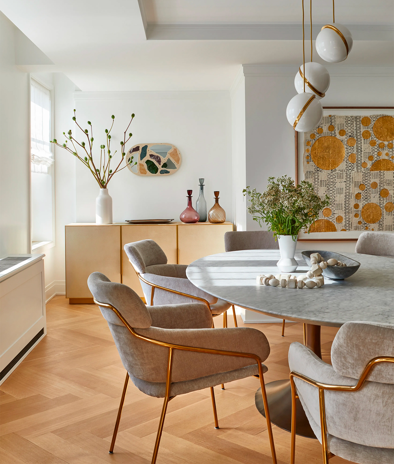
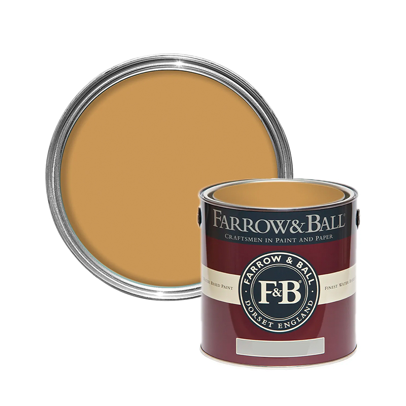
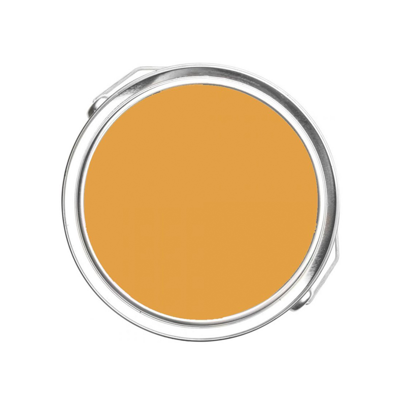
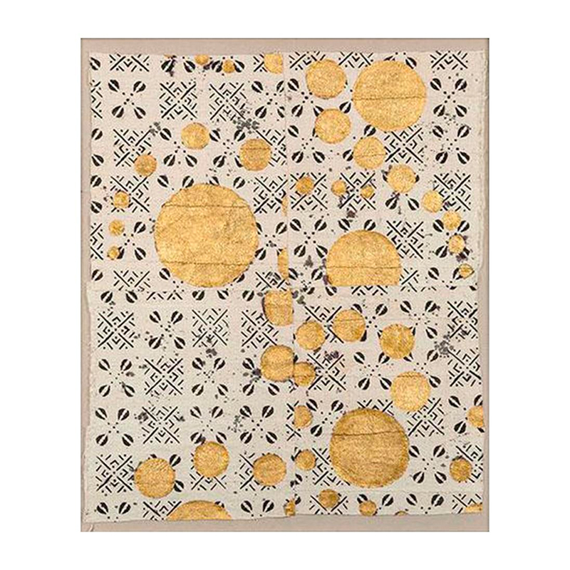
JACOB SNAVELY COURTESY OF TINA RAMCHANDANI
7. Marigold
Otherwise, if buttercup feels too cheery for you, darker yellows—like marigold—can glam up a room while still keeping the overall mood calm. Whereas you’ll want brighter yellows in rooms you want to stay awake, darker or even muted yellows are ideal for calmer spaces (think living spaces, bedrooms and even bathrooms). Additionally, when matched with a strong neutral like black or grey, they balance each other perfectly, so you get the brightness you’re looking for while maintaining a sense of coziness.
Shop The Look
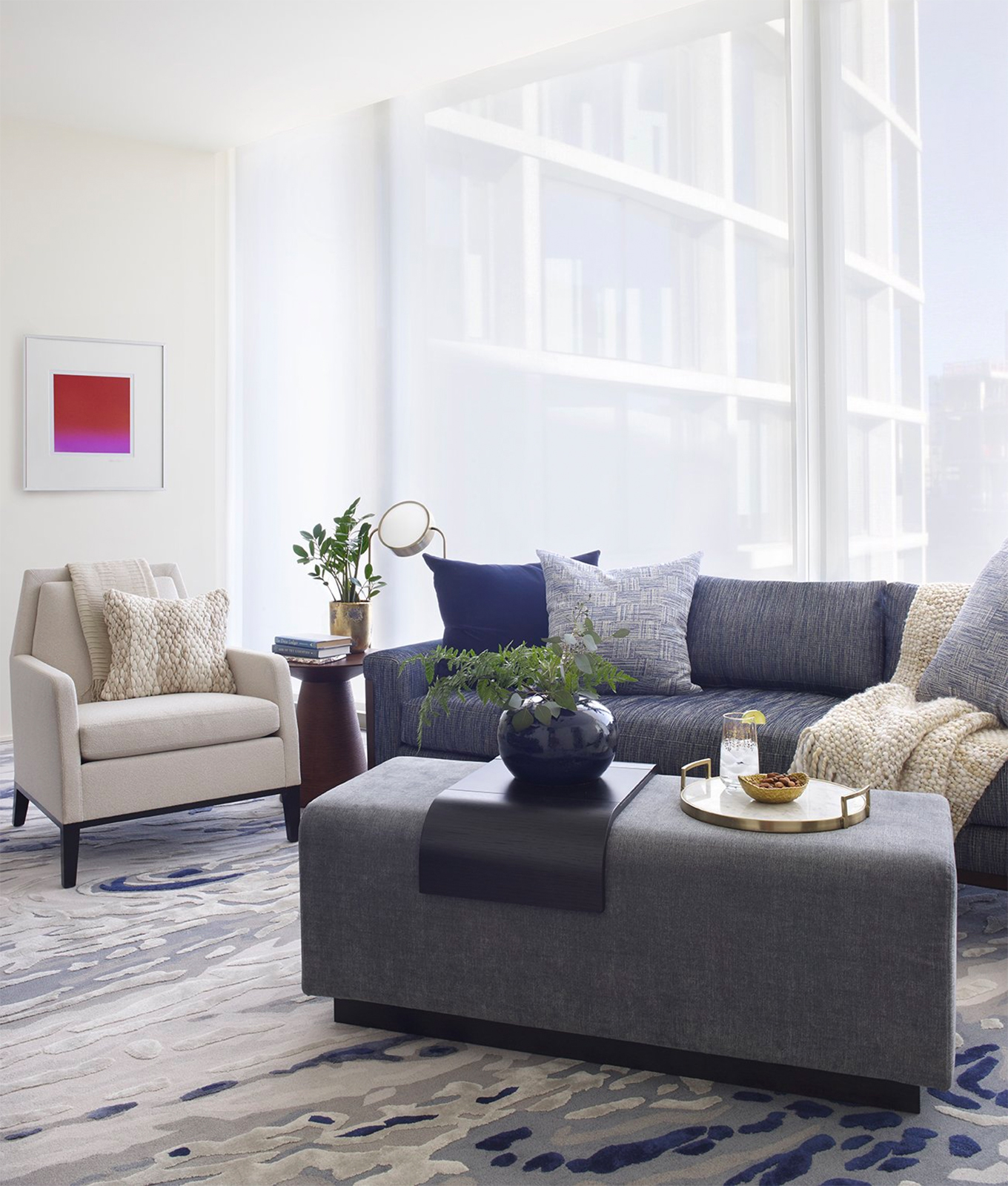
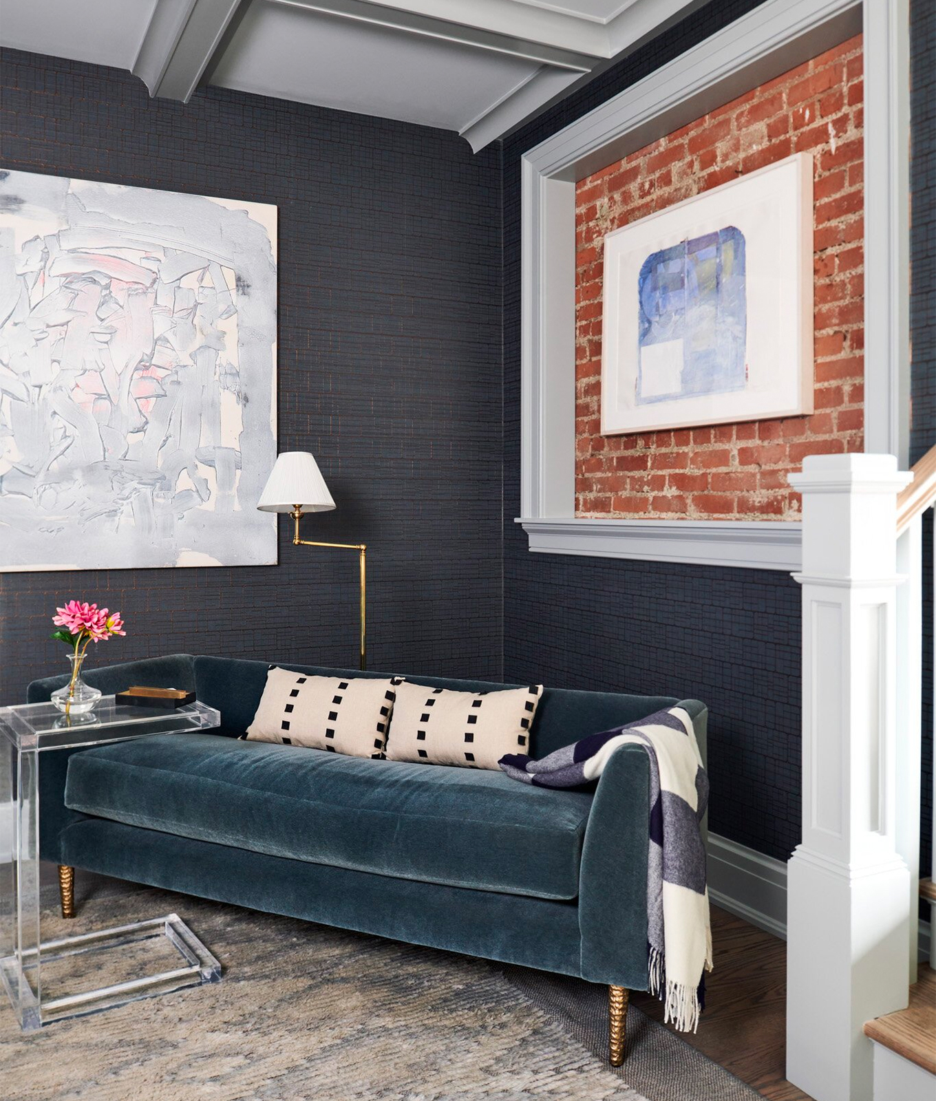
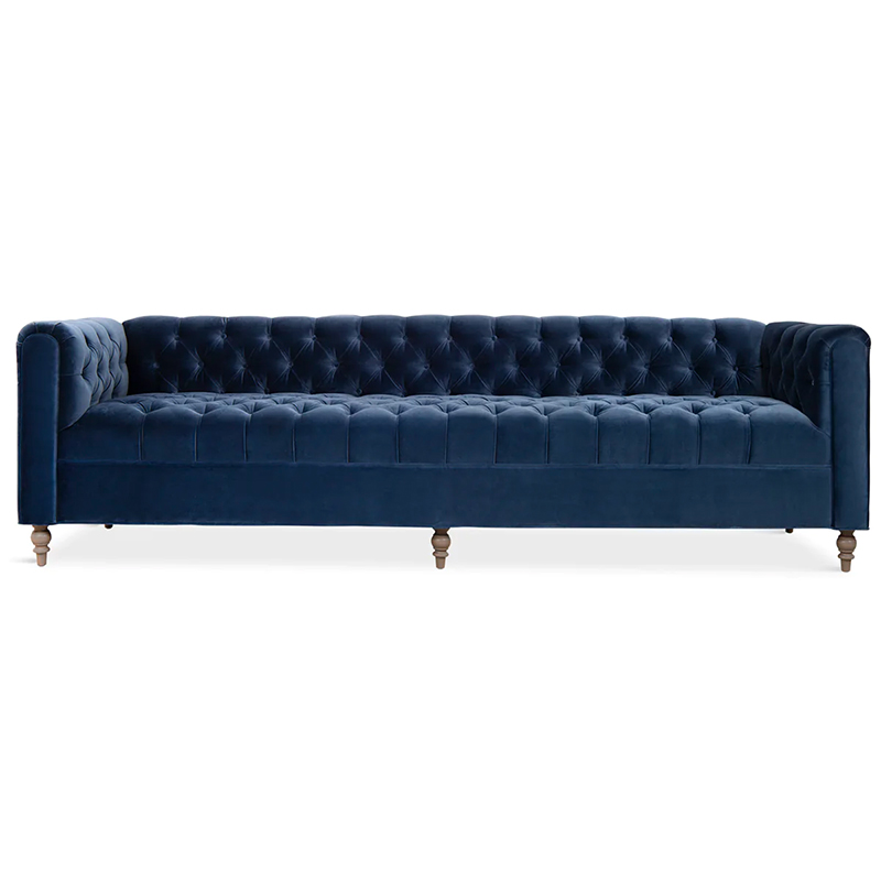
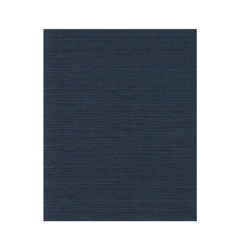
ELLEN MCDERMOTT COURTESY OF TINA RAMCHANDANI
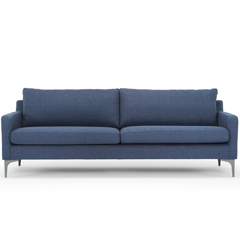
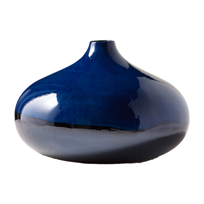
8. Navy Blue
This year we’re vowing not to sleep on navy blue, alright? Because when coupled with gray tones, the combination is totally timeless. Perhaps the greatest part, though, is that you really don’t have to feel worried about going overboard, because it won’t get overwhelming like other more saturated blues may. If you’re looking for something a bit more permanent, consider a navy ottoman or armchair.
JACOB SNAVELY COURTESY OF TINA RAMCHANDANI
9. Lilac
Like orange, purple may seem best suited for a child’s room, but when softer hues like lilac or lavender are incorporated into a design, magic happens. “For me, purple has been the most difficult, because it can go dark so quickly,” Ramchandani commiserates. “Take time to really understand where your ‘difficult’ colors will be placed in the room and on what pieces, so you can understand how they impact the rest of the space.”
Her best tip for every design, even with simpler colors? Always start with a color scheme so you know whether each piece will work in the space ahead of time. Oh, and if you want to mix and match colors, Tina likes to group colors by warm or cool. So, if you’re feeling lilac for your spring pick-me-up and want to add a second color to the mix, consider light blues or greens.
Shop The Look
If Your Walls Are Crisp White, Try…
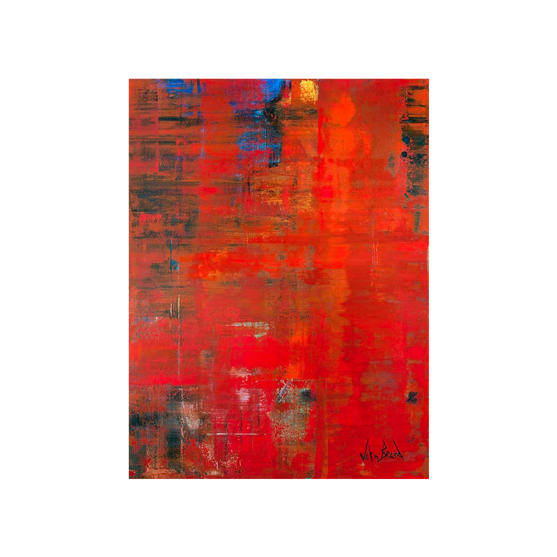
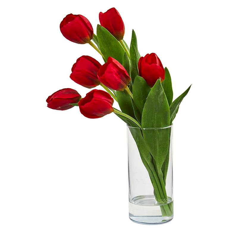
Wayfair/John Beard
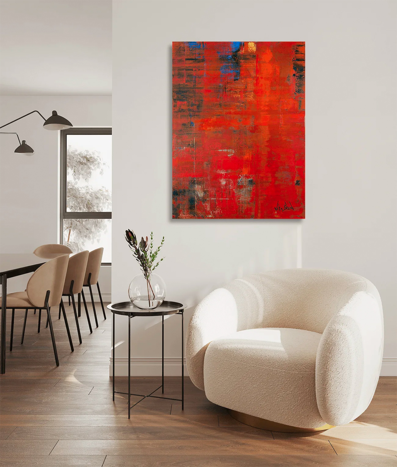
10. Tulip Red
There’s just something about the freshness of red and the crispness of white that make the two *chef’s kiss* and, in turn, perfect for spring.
Plus, while red definitely makes a trendy design statement today, it’s also timeless and sexy, so if that’s your modus operandi, this is your sign to have at it. Given how bold the color is, it makes sense to ease into things with inexpensive swaps, like flowers, throw blankets and art.
Shop The Look
LISA RUSSMAN COURTESY OF TINA RAMCHANDANI
11. Royal Blue
In the vein of bold colors, royal blue is another one that will instantly become the focal point of a crisp white room… in the best way. As sharp and sophisticated as the shade looks (particularly when paired with bright white), it can be easily transitioned into a cozy oasis for the colder months with the addition of warmer neutrals and brown tones to balance the brightness.
Whatever direction you go in, Ramchandani has a simple plan for ensuring you don’t go overboard—or get so intimidated you ditch your refresh altogether: “Pick one or two colors that you'd like to incorporate into your home, plan how you will add color and on which pieces, and then execute.” You’ve got this.
Shop The Look
Want to know which buzzy products are *really* worth buying? Sign up for our shopping newsletter to uncover our favorite finds.