This Is the One Home Trend We’re Seeing Everywhere in Brooklyn Right Now
PureWow editors select every item that appears on this page, and some items may be gifted to us. Additionally, PureWow may earn compensation through affiliate links within the story. All prices are accurate upon date of publish. You can learn more about the affiliate process here.
For some New Yorkers, Fashion Week is the event of the season (peep: Zendaya’s sheer Valentino catsuit). Yet, for the interior designers and artists of Brooklyn, there’s another Super Bowl that happens every year: The Brooklyn Heights Designer Showhouse. The event, which took place in a classic Greek Revival townhome this year, is basically the equivalent of New York Fashion Week. Each room is assigned to a different NYC designer—and from furnishings to decor to paint colors—the house acts as a living trend forecast of what’s going to be hot in home for the following season.
Yet, this year, we noticed something interesting happening: Each designer told a similar, moody jewel-toned color story, underscoring that this aesthetic is going to be everywhere in the year (or years) ahead.
WHAT ARE MOODY JEWEL TONES?
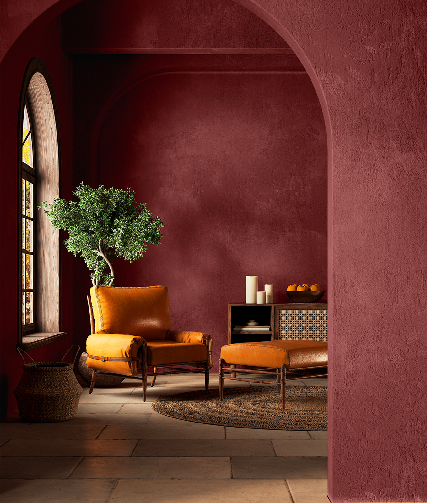
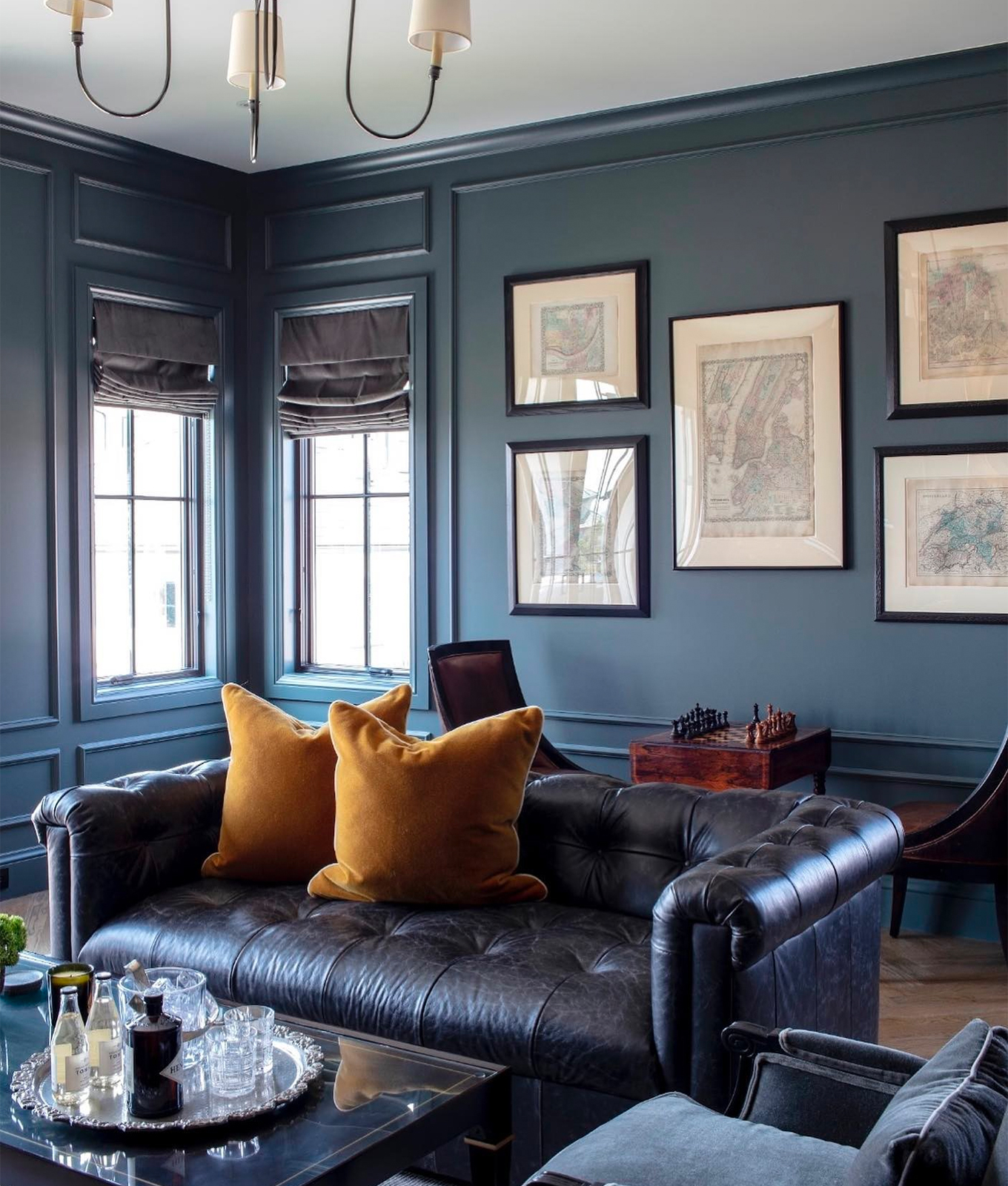
Moody jewel tones are basically just a relaxed, rustic version of the ‘20s art deco movement. Think: pistachio green instead of emerald, ochre brown instead of citron, aubergine instead of amethyst and burgundy instead of ruby red. Everything is saturated yet soothing, with pops of color that pull directly from nature (see: PureWow’s Color of The Year). To that end, it comes as no surprise that we saw these hues woven throughout the Brooklyn showhouse. Hipstoric heritage (a style that mixes traditional and eclectic design) is poised to be everywhere in the coming months—and rich, muted hues are exactly how you blend old with new.
Take it from designer Jenna Chused, who spearheaded the design of the parlor room above: “I have an affinity for unique vintage finds and antique art, so I tried to incorporate a lot of soft and deep saturated colors,” she explains. “This portrait from the ‘30s had a beautiful green background [with a woman wearing] a burgundy dress—and that really inspired the basic palette… I tried to choose a very, very pale pistachio color for the wall that was more of a neutral [and offset that with] rich colors (like this burgundy serpentine sofa) in the furnishings.”
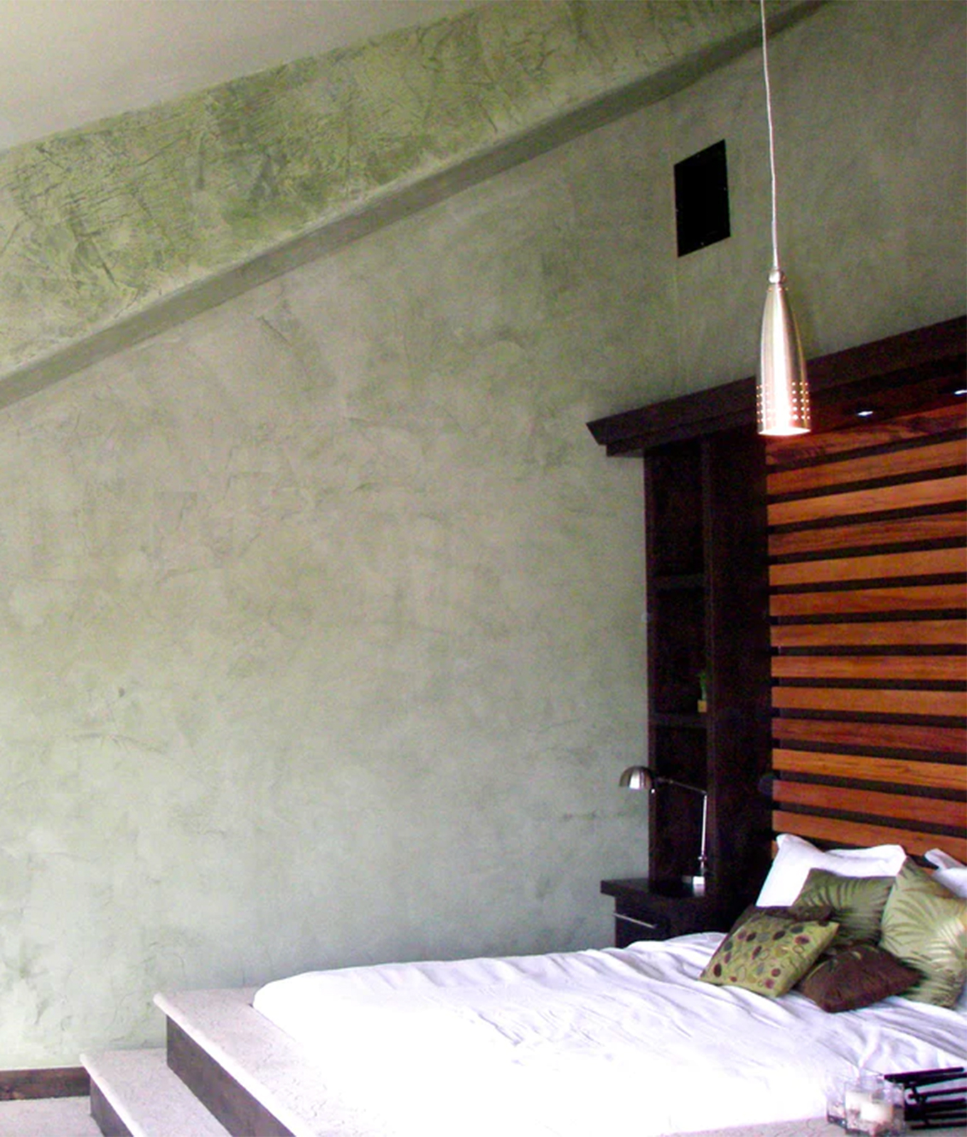
Designer Mike Rupp echoed this, where he wanted his lounge room to feel brooding and romantic. “I worked with decorative painter Mark Chamberlain on this project, and he says to me, ‘Well, it sounds like you're designing a room for a James Bond villain,’” Rupp starts. “I actually think it's more of a James Bond villainette look...less evil man cave and more end-of-the-day respite for a woman in charge." He then goes on to say, “I wanted to add a dimension to this burnished limewash, so it would create a depth and intrigue in the form of a dreamy mist, if you will.”
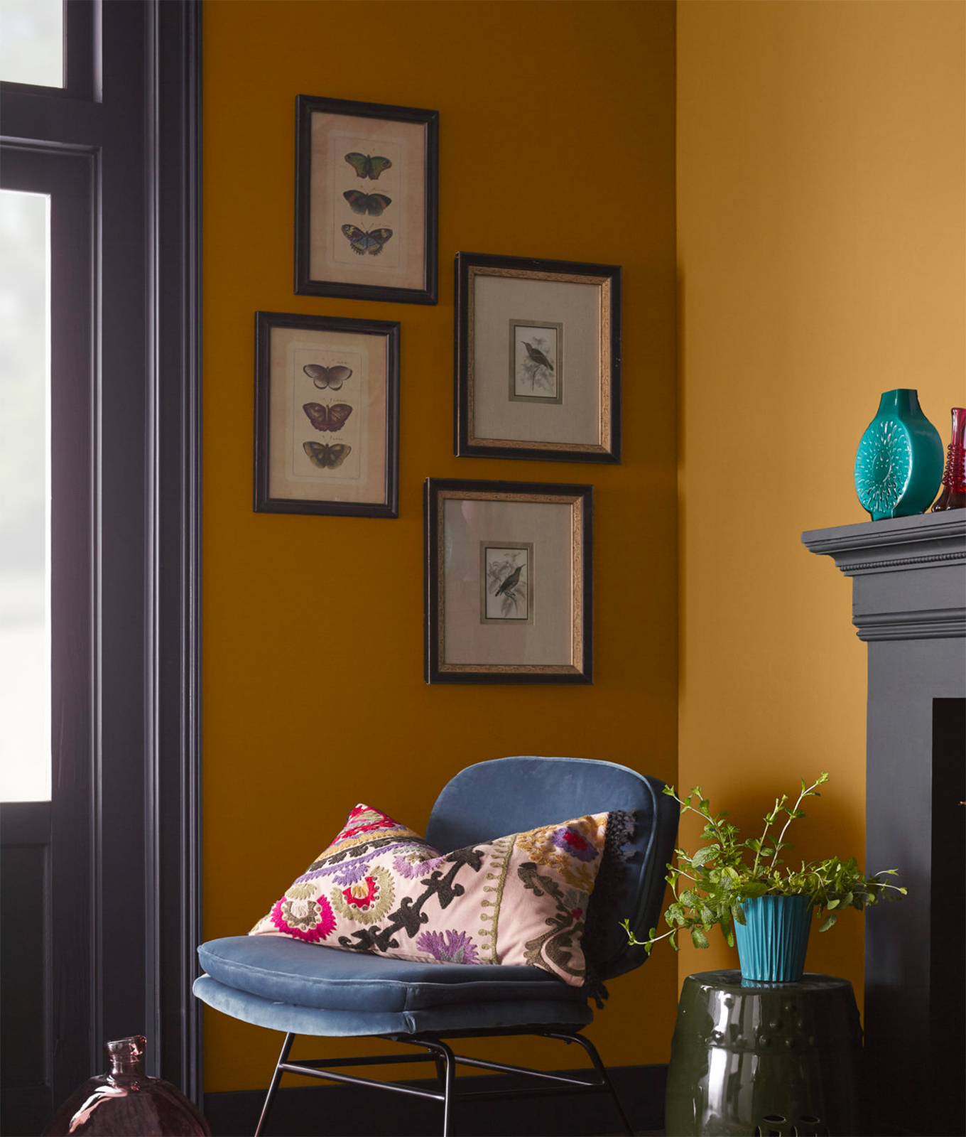
The kitchen, however, took a more playful approach to the trend, where designer Meghan Laky says, “We didn’t have a lot of natural light, so we wanted to bring in a lot of muted pink accents and make it feel really warm and cozy.” On top of using a toned-down pink on the walls and trims, Laky also incorporated the trend into her countertop and lighting selections: “The intent for the space was to embrace a warm, comfy, inviting feeling—and the leather-finished] countertop from Walker Zanger along with the brass circular pendants from Circa Lighting were a huge part in that.”
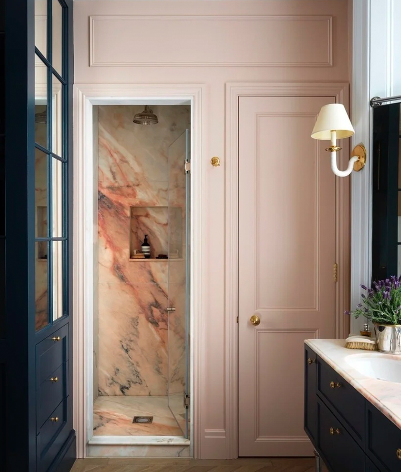
Speaking of lighting: In the hallway, Laurie Blumenfeld embraced dripping blush tones in a mural by Wall Paper Project, paired with a dazzling gradient chandelier by Avram Rusu Studio. "I decided to take the space and make it moody and dramatic and interesting in the moment," she tells Deborah Martin of Aspire Design & Home. Rusu's Continuum fixture also appeared in the bathroom as a sconce—though this time, it brought metallic contrast to the depth of the walls by Innovations in Wallcoverings. "Because we had all these warm saturated colors in here, I thought it would be nice to make the bathroom feel a little more ethereal," Martin explains.
Need some more inspo (and paint samples to hang on your wall)? We gotcha covered. Below, find the five best moody jewel-toned paint colors to try in 2023.
THE BEST MOODY JEWEL-TONE PAINT COLORS OF 2023
Farrow&Ball/@studiothomas
Design & Cultures Editor
- Writes across all design and culture verticals, including interiors, art, travel, relationships, sex and family.
- More than five years of experience in editorial, including podcast production and on-camera coverage
- Holds a dual degree in communications and media law and policy from Indiana University, Bloomington