Rustic Royalty Is In—And 2026’s Colors of the Year Just Crowned It

Goodbye minimalism, hello manor house

Colors of the Year 2026 hero
Graham & Brown/Dutch Boy/Behr

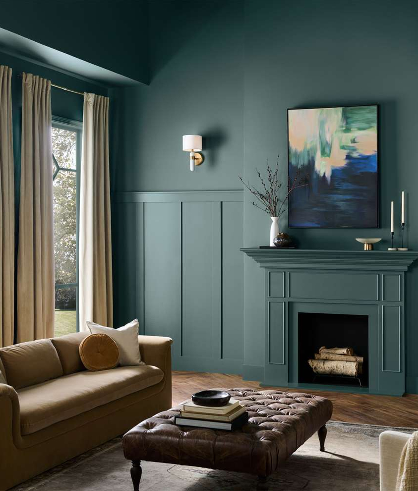
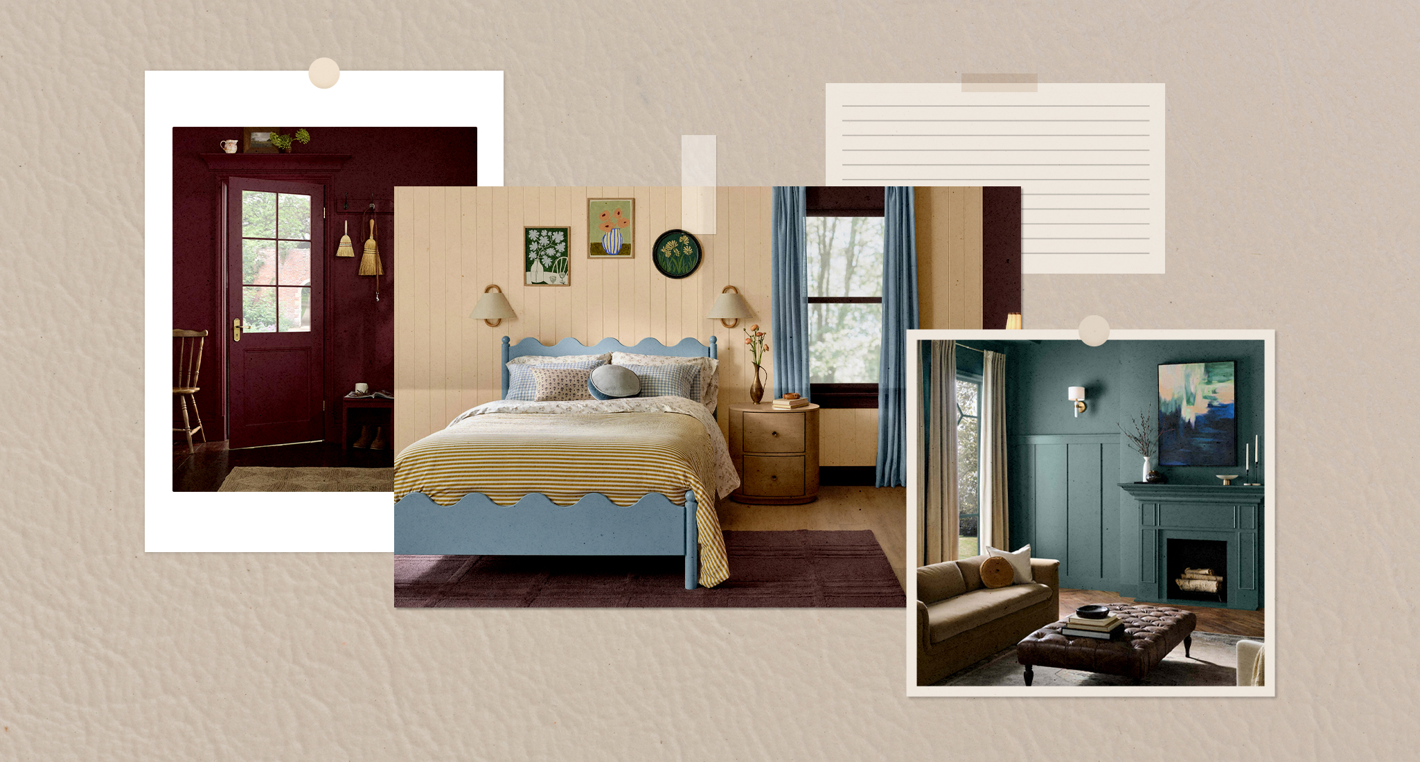
At first glance, the 2026 Colors of the Year couldn’t be more varied. We’ve got Behr’s smoky jade, C2 Paint’s French limestone-inspired ochre, Glidden’s red-brown mahogany and Graham & Brown’s plum (a shade so rich, it practically demands a velvet chaise). On paper, they shouldn’t work together. But like the layered interiors of a countryside manor—or the mismatched Baccarat wine glasses you inherit from a great aunt’s estate—they somehow do.

If 2025 was about “Rich Auntie energy,” 2026’s shades take it further, rooting itself in heritage and craftsmanship. The pendulum has officially swung away from blank-slate minimalism. According to Zillow’s latest survey, buyers may offer as much as $2,590 more for homes with the right paint colors—which all happen to skew moody and weathered instead of stark and white. Not to mention that, in fashion, Lyst’s Q2 Index Report signals the same appetite: Pucci’s rise (up 96 percent in searches) points to a Euro-core takeover—swirls of plum and ochre endorsed by celebs like Hailey Bieber and Dua Lipa. Even accessories leaned rustic and storied, with shell pendants and talismanic jewelry “tapping into the emotional register of handcrafted nostalgia.”

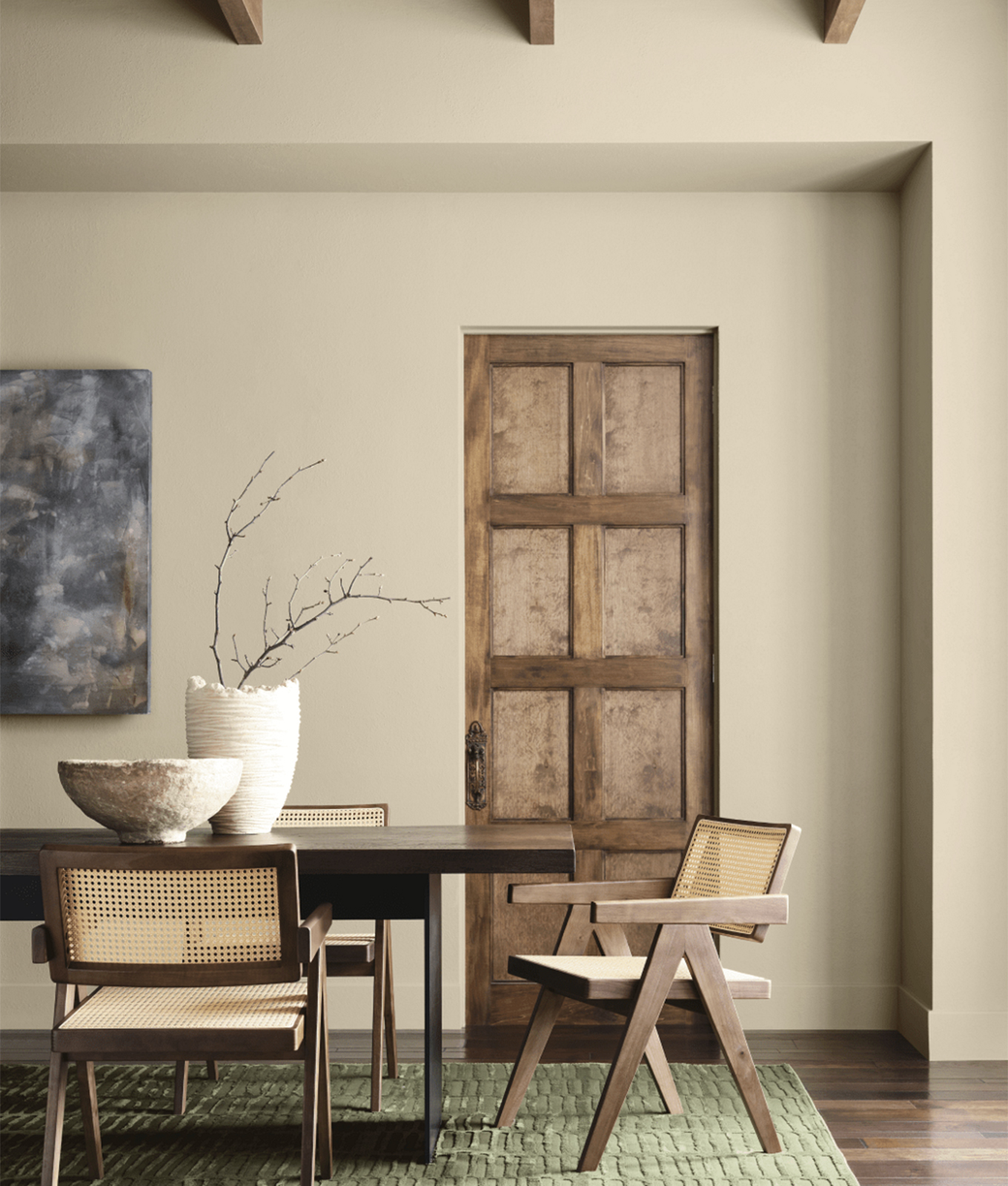
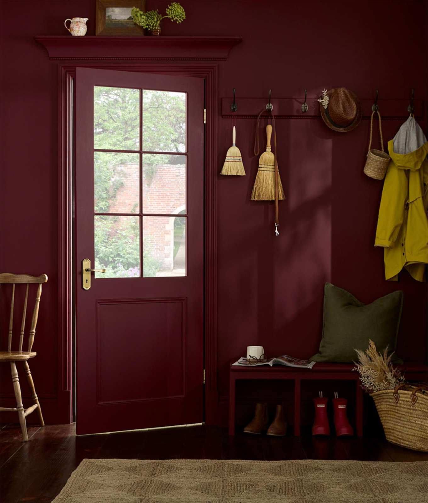
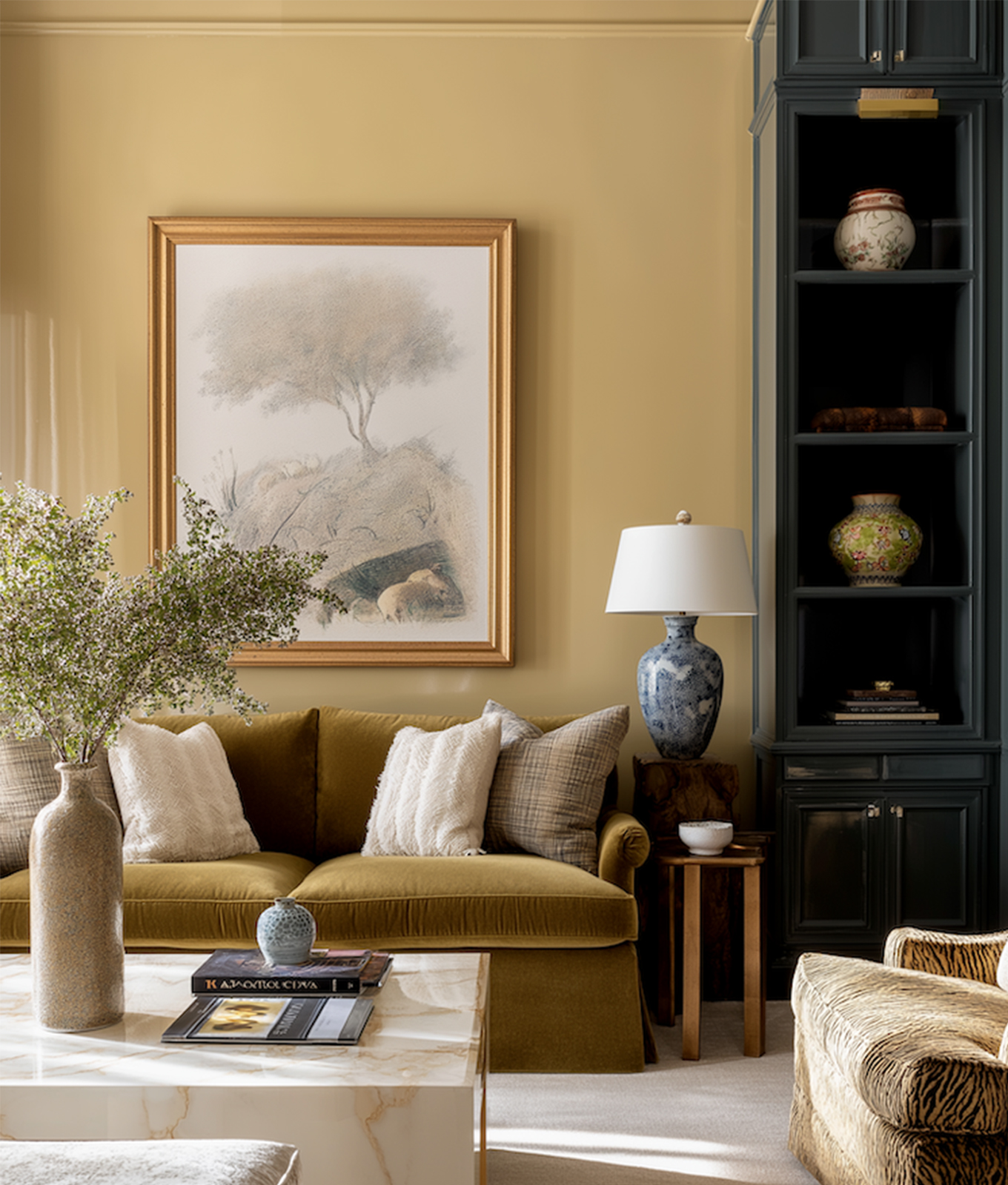
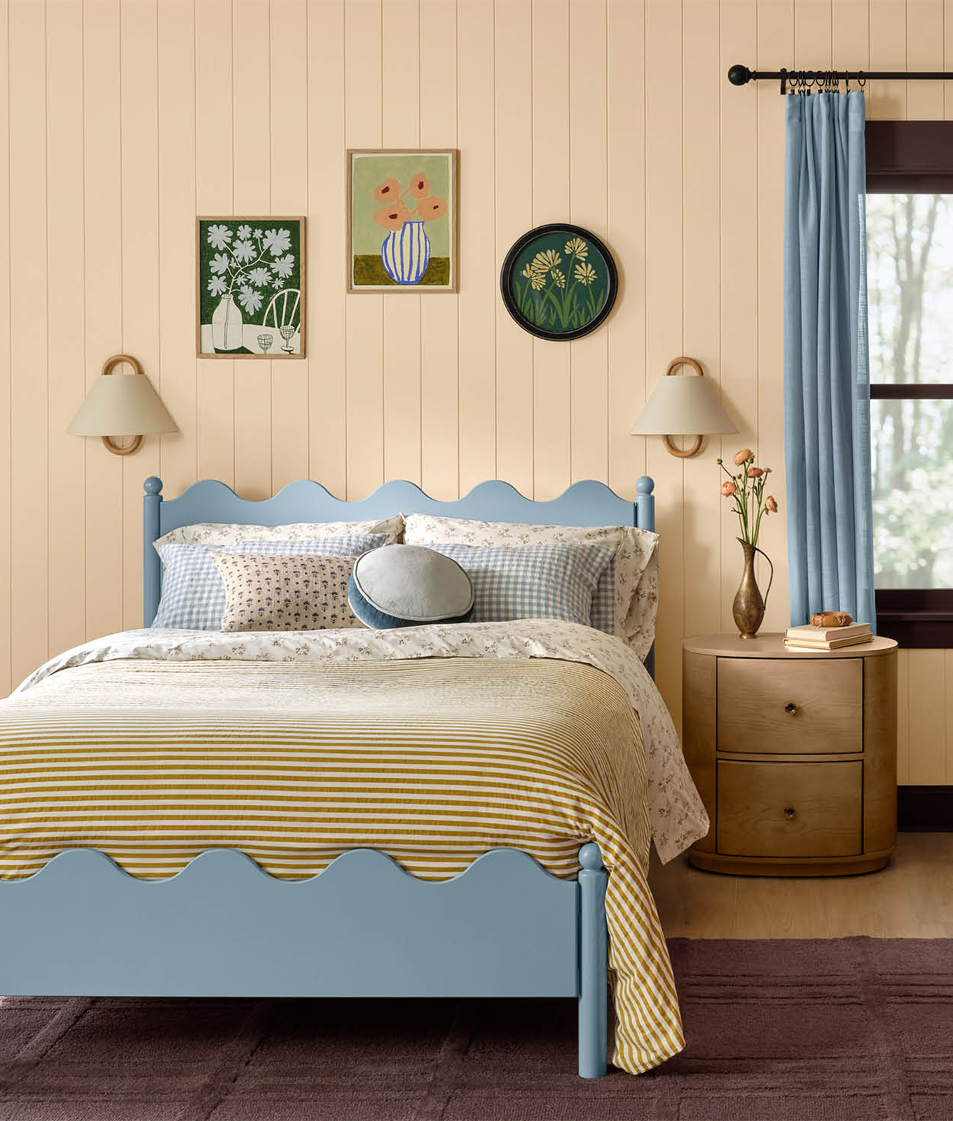
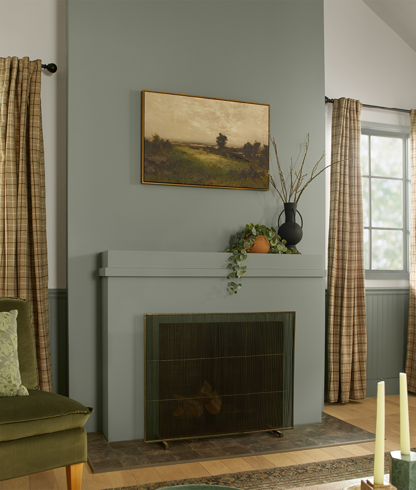
The TL;DR? This is a moment I’m calling Rustic Royalty. The Colors of the Year all seem to echo grounded elegance—shades that draw from nature, then elevate them toward something regal. Every hue in feels as if it could live in a French chateau or an English country estate, without ever veering into stuffy tradition. They’re tactile, tactile, tactile—meant to be paired with velvet, linen, terracotta and weathered wood. Ultimately, they’re proof that what we want in 2026 is less about trend-chasing and more about surrounding ourselves with an oxymoron: Hues that somehow feel both grandiose and down to earth at the same time. Let’s take a closer look at each of the crowned Colors of the Year, shall we?

These are the New Coastal Colors for 2026 


Khaki gets a bad rap for being bland, but Universal Khaki proves otherwise. This is a grounded tan that conjures barn coats, old stone walls and sun-bleached linen. It’s not neutral as in “forgettable”—it’s neutral as in “foundational.” There’s longevity in its wearability. A shade you can layer endlessly—against warm woods, weathered leathers even jewel tones—and it never feels like it’s trying too hard. Think: understated in the same way a Burberry trench coat always feels timeless.

The boldest shade of the bunch? This deep plum with oxblood undertones. Divine Damson is drama embodied, like the velvet lining of a vintage coat or the upholstery in a dignified dining room. It’s moody, deep and utterly unapologetic. Too much of it might overwhelm, but in the right dose—a powder room, a velvet sofa, a library wall—it transforms the ordinary into the extraordinary. IMO, this is the crown jewel of the Rustic Royalty palette.

Named after a French wine region, Epernay is a pale ochre with vineyard warmth. It’s architectural in its elegance, evoking golden-hour light on centuries-old limestone. Unlike cooler neutrals, this one radiates softness and subtle luxury. Imagine it on stucco walls, catching the late-afternoon sun, or as the backdrop for a collection of rustic pottery. It captures everything Rustic Royalty stands for: permanence, refinement and a sense of grounding.

Next up: a smoky jade blue-green that instantly recalls vintage emerald rings and worn velvet upholstery. Hidden Gem feels like walking into an old botanical conservatory, where the glass panes are fogged and the air smells faintly of moss. It’s luxurious yet weathered—a shade that can anchor a library wall as easily as it can soften a bedroom accent. And while green has had its monopoly on design in the past few years, this one leans more toward heirloom than trendy sage. Think less “millennial plant parent” and more “Christie’s estate sale.”

Creamy beige with a warmth that feels like plaster walls in a French farmhouse, Melodious Ivory softens everything it touches, giving a space that sun-aged, parchment-like glow. It’s not sterile white or generic beige. Instead, it has the patina of history—gentle, heritage-driven, comforting. It’s the quietest member of this year’s palette, but no less essential: a hue that makes terracotta tiles, oak beams and velvet curtains sing.

A nostalgic gray-green that could’ve been lifted from antique English wallpaper. It’s botanical and soft, yes, but there’s elegance in its restraint. Warm Eucalyptus isn’t trying to be flashy; it’s the background player that makes everything else pop, like weathered oak furniture or a handwoven rug. In the wrong light, it might even read like a faded heirloom—but that’s the point. It is comfort wrapped in refinement, the color of heritage linens and countryside manors.


profile pic WP

Associate Lifestyle Editor

  • Writes across all lifestyle verticals, including relationships and sex, home, finance, fashion and beauty
  • More than five years of experience in editorial, including podcast production and on-camera coverage
  • Holds a dual degree in communications and media law and policy from Indiana University, Bloomington