ComScore

Your Eyes Aren't Deceiving You—This Color Is Popping Up Everywhere (and Will Be Even Hotter in 2022)

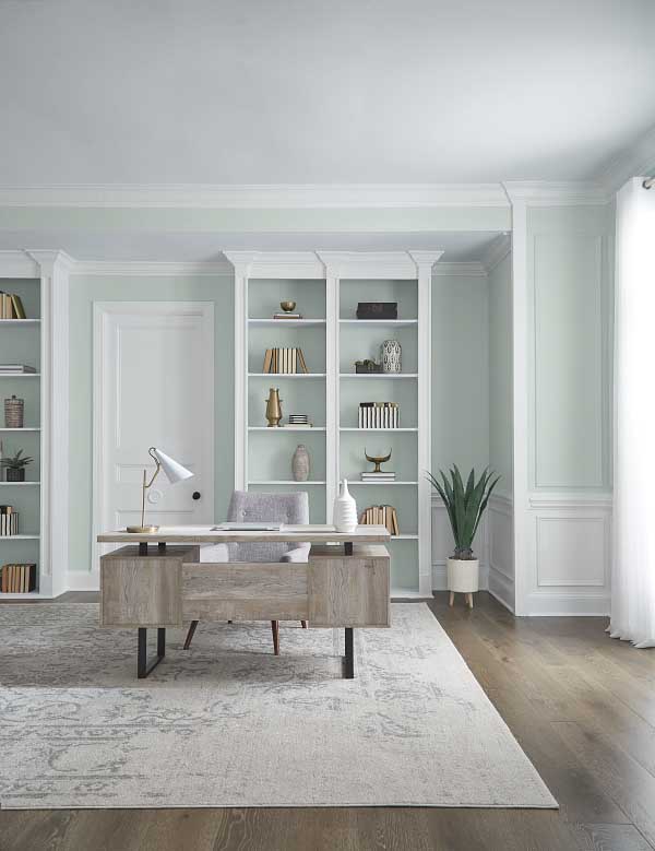
In 2020, color trends shifted to soothing blues, nature-inspired neutrals and soft, stress-reducing shades to encourage moments of Zen (something we all needed during peak lockdown season). In 2021, we stood by TikTok as it replaced these colors with warm, earthy neutrals and it’s no secret that bold, happy hues are dominating this year’s fall design trends. So what colors should we expect to see next? Three brands have revealed their Color of the Year for 2022, and surprisingly, they’ve all selected a concordant shade of sea glass or olive-toned pale green. Of course, this doesn’t come as a shock; green kitchens have been trending for quite a while now, and a survey conducted by The Harris Poll found that online searches for “green paint” have more than doubled since 2020. In fact, a few months ago, we spoke with Stephanie Pierce, the director of design and trends at MasterBrand Cabinets, who said: “Green is quickly gaining color confidence with homeowners who are realizing how well this color complements others and changes easily with the seasons just like in nature.”

But what we find really fascinating? It’s the first time in years that multiple brands have selected nearly the same shade. While we’re not sure what Pantone will reveal in December, these selections convey that we’re 1.) all craving a sense of adventure and bringing the outdoors in, and 2.) ready to break away from dull, pre-COVID hues of white, gray and beige in 2022.

TikTok is Waving Goodbye to This Home Color Trend (And Replacing it With Some Seriously Cozy Ones)


green color trend 1 vert
Design by Jean Stoffer (Photo by Stoffer Photography)

1. Sherwin Williams: Evergreen Fog Sw9130

Sherwin Williams’ Evergreen Fog is an invigorating and sumptuous gray-green hue that signifies the beginning of a new era. “Evergreen Fog is a sophisticated wash of color for spaces that crave a subtle yet stunning statement shade,” Sue Wadden, director of color marketing at Sherwin-Williams, says in a press release. After two years of being told who, what, when, where and why, we’ve begun to adopt empowering, bold hues as a form of peaceful protest (just call us the Gloria Steinem of interiors). But next year, Sherwin Williams predicts we’ll be celebrating the lessons we’ve learned with more down-to-earth greens that serve as reminders of how far we’ve come. And, while the shade falls in line with post-pandemic themes of prioritizing comfort and finding tranquility in indoor-outdoor connections, it also symbolizes growth and effectively turning over a new leaf (no pun intended).

“We told a story of balance and rhythm through color last year as we transitioned into a time of stillness,” Wadden explains. “We are holding that balance in one hand and embracing growth and adaptability in the other as we move toward a new vision and discovery of our world.” The shade is also part of the METHOD palette in Sherwin-Williams’ 2022 Colormix Forecast, which features rich, organic tones that balance postmodern minimalism with art-deco opulence. “Create depth and texture with a mix of natural-looking textiles,” Wadden suggests. “Add a little gleam with a fusion of metals—Champagne gold, warm brass or inky black.”

green color trend 2 vert
Courtesy of Behr

2. Behr: Breezeway Mq3-21

While keeping with the same theme of renewal and organic, grounding hues, Breezeway pulls inspiration from the sea with a cool, light green shade of sea glass. “It's a gentle, silvery-green that provides a sense of tranquility and peace, inspired by earth’s beauty and by sea glass found on salty beaches,” says Erika Woelfel, Vice President of Color and Creative Services at Behr, in a press release. What we love most about Behr’s shade is that it takes a detour from the deep, forest greens that mimic sprawling evergreen treetops. Instead, the color parallels 2021’s coastal farmhouse trend, which has created a space for the seaside within nature-inspired palettes.

Breezeway inspires us to fully embrace the hobbies or adventures, both near and far, that excite us,” Woelfel adds. "We look forward to a color that welcomes a hopeful sense of renewal, restoration and healing.” While the shade continues the color theme of finding peace through connections with nature, it also introduces a subtle layer of optimism and encouragement to gradually break out of the comfort zones that limited us in 2020. Sarah Fishburne, Director of Design at Home Depot, expands: “For many months, the outdoors were the only retreat from a life lived entirely inside the home. As we venture back out, we want to bring nature indoors without overpowering it.” She suggests using Breezeway “as an accent color to freshen up doors and cabinetry,” or in “an entryway, [creating a] transition from the bustle of the outdoors to an inviting atmosphere in your home.”

green color trend 3 vert
Courtesy of PPG

3. Ppg: Olive Sprig 1125-4

Last but not least? Olive Sprig from PPG. While its green-gray, aloe vera hue evokes tranquility and renewal, its versatility acts as a grounding force, sending a message of resilience. “As many of us know following a year of lockdown, the easiest way to shift your mindset is to change your environment,” says Senior Color Marketing Manager of PPG Amy Donato in a company announcement. “While we begin to trade sweatpants for strappy shoes, recipes for reservations, and a night in for a night out, our paint color preferences are shifting too, in both residential and commercial spaces.

"You can expect to see shades like Olive Sprig paired with escapist and vintage decor as we use nods from the past to help guide our future. In their announcement, PPG expands on this, explaining, “Just as trends in the 1920s were marked by opulence, metallics, rich woods, layers, moody colors and angular shapes, today’s home décor is drawing inspiration from the Antiquity, Baroque and Renaissance eras of art, sculpture and architectural forms. This colorful embrace is thought to reflect an optimistic rebellion, a sign of personal expression or soothing self-care.”


RELATED: This Is The Year Green Beats Blue in The Kitchen


profile pic WP

Associate Editor

Sydney Meister is PureWow's Associate Editor, covering everything from dating trends and relationship advice (here's looking at you, 'soonicorns') to interior design, beauty...