ComScore

The Hottest Paint Color Nobody Saw Coming: How ‘Storms in Paris’ Is Taking Over Homes Everywhere

PureWow editors select every item that appears on this page, and the company may earn compensation through affiliate links within the story. All prices are accurate upon date of publish. You can learn more about the affiliate process here.

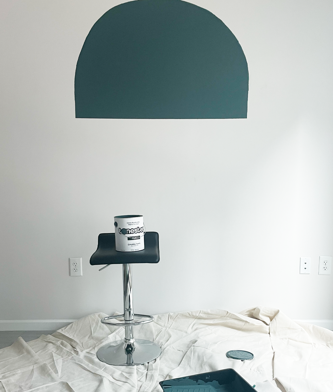
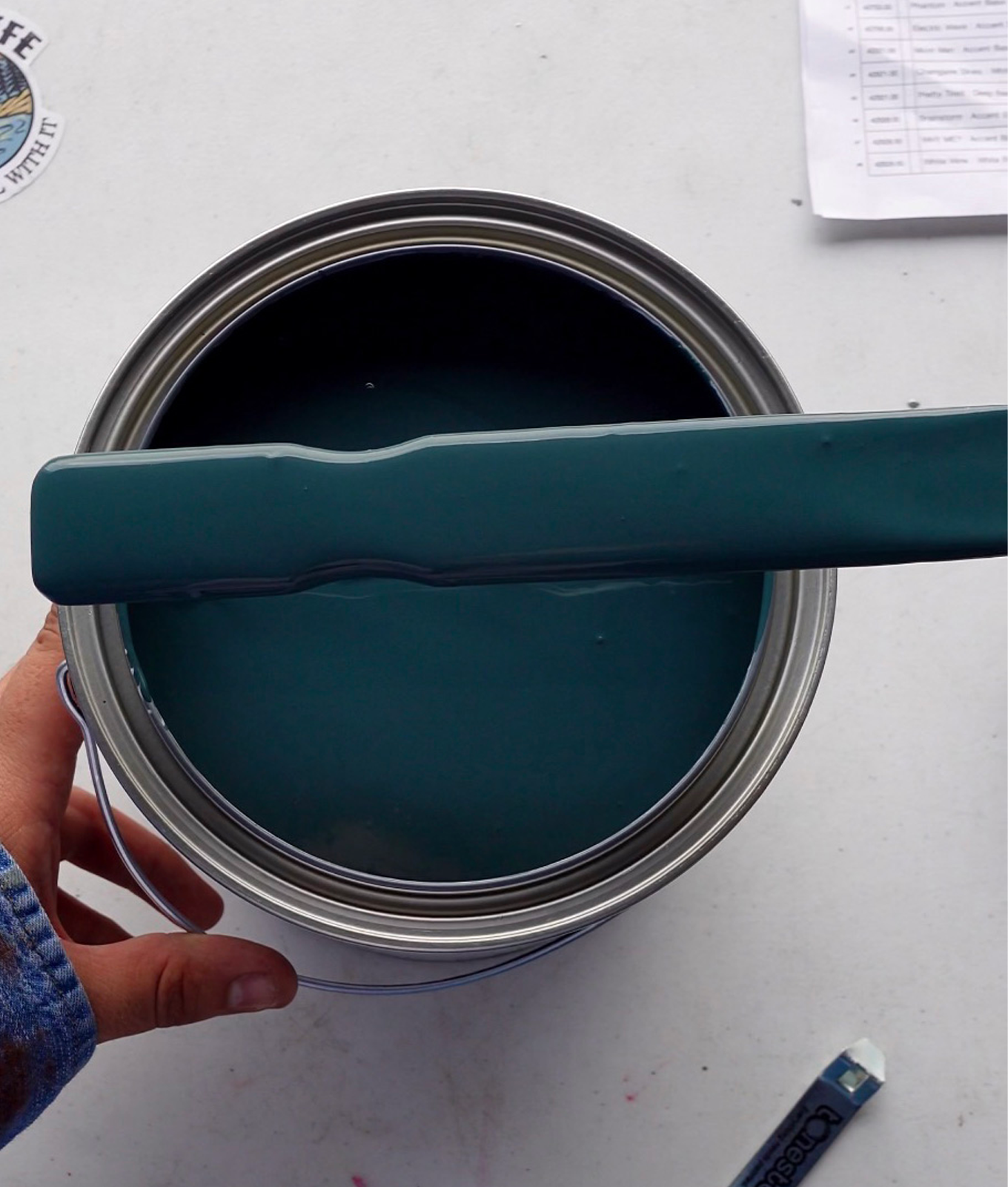
Money doesn’t just jiggle, jiggle or fold—it also talks. And when it comes to paint color trends, it can be very revealing. Pale green may have been heralded as 2022’s color of the year by most major paint brands, but at least for one startup paint company, it’s not the shade everyone’s buying. That’d be something much moodier and darker—a color known as Storms in Paris.

Searches for the shade skyrocketed after Tonester Paints revealed it as his best-seller on TikTok, garnering 2.2 million likes and close to 10,000 comments, with many declaring it’s the color they’d be searching for to coat their bedrooms and living rooms.

“This color made me genuinely believe that paint color trends for interior design are just made up, because all the other paint color companies in the industry say their trending colors are just light and neutrals, like grays and beiges,” Tonester creator and founder Tony Piloseno says in the video. (The single shade accounts for 50 percent of Tonester’s sales.)

storms in paris color
Tonester Paints

Storms in Paris’s success may seem random, but it harkens back to a centuries-old color preference—and further signals that homeowners everywhere are tired of playing it safe with bland interiors.

In fact, Piloseno came up with the color after researching Paris Green, a pigment popular in the early 19th century after Empress Eugenie of France wore a gown in that color to the Paris Opera. The actual pigment was made by mixing copper and arsenic, creating a brighter, longer-lasting color—and its toxic ingredients made artisans incredibly sick. “This was a pigment of high exclusivity for paintings, prints and fashion but had the consequences of life and death,” Piloseno explained via email. He set out to create his own riff on the color—minus the arsenic and copper, of course.

storms in paris color closeup
Tonester Paints

Playing with black, gold, green and white, he came up with the jewel-toned green, naming it with a nod to its inspiration. “I had felt that the color would create the user's space into its own piece of art,” he says. “With the rich and deep tones of the green, it would create an elegant and intriguing element to the human eye.”

It’s an instant way to make a statement, and it dovetails with two other trends on the rise—the “dark academia” TikTok aesthetic, as well as rising interest on Pinterest over the past year for “seductive bedroom ideas.” It also pairs nicely with two other personality-driven color trends: coral-y pinks and golden yellow. (Tonester has paired Storms in Paris with both.)

Another paint company, Backdrop, has seen a similar surge in saturated blues and greens. During the first few weeks of April 2020, sales of Saturday on Sunday, a dark greenish-blue, rose 800 percent. These shades can be cocooning and comforting, creating a sense of sanctuary from the rest of the world, while adding a sense of personality.

“I think the reason [Storms in Paris] has resonated with my customers so well is the true uniqueness of the color. It is a color that can have a true impact on a person's space when applied (visually and mentally),” Piloseno explains. “I also believe that homeowners are wanting to stray away from neutrals and want to add color to their homes as a way to make their space speak for them as an individual.”

It makes sense: It’s your home—it should reflect you.


candace davison bio

VP of editorial, recipe developer, kitsch-lover

Candace Davison oversees PureWow's food and home content, as well as its franchises, like the PureWow100 review series and the Happy Kid Awards. She’s covered all things lifestyle...