ComScore

The Evolution of Millennial Pink—from Basic Blush to Neutral Staple

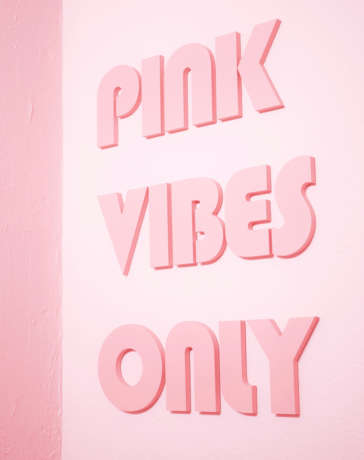
“A rose by any other name would smell as sweet,” so the Shakespearean quote-turned-cross-stitch-pattern goes, and for the most part, the adage holds true. Unless that rose is called millennial pink. Since the not-quite-bubblegum, not-quite-salmon shade was officially coined as such in Véronique Hyland’s 2016 essay, it’s gone from the hue you rosé-d all day with (while passing rosy-hued ads and debating which peachy-pink velvet sofa would best complement the neon sign you’d hang above it) to a basic—ahem, cheugy—shade everyone’s all too quick to declare passé. (Indeed, one of the top related questions people Google when searching millennial pink is asking whether it’s over—and what the new “it” color is.)

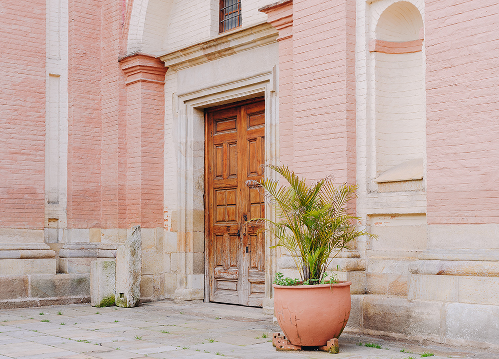
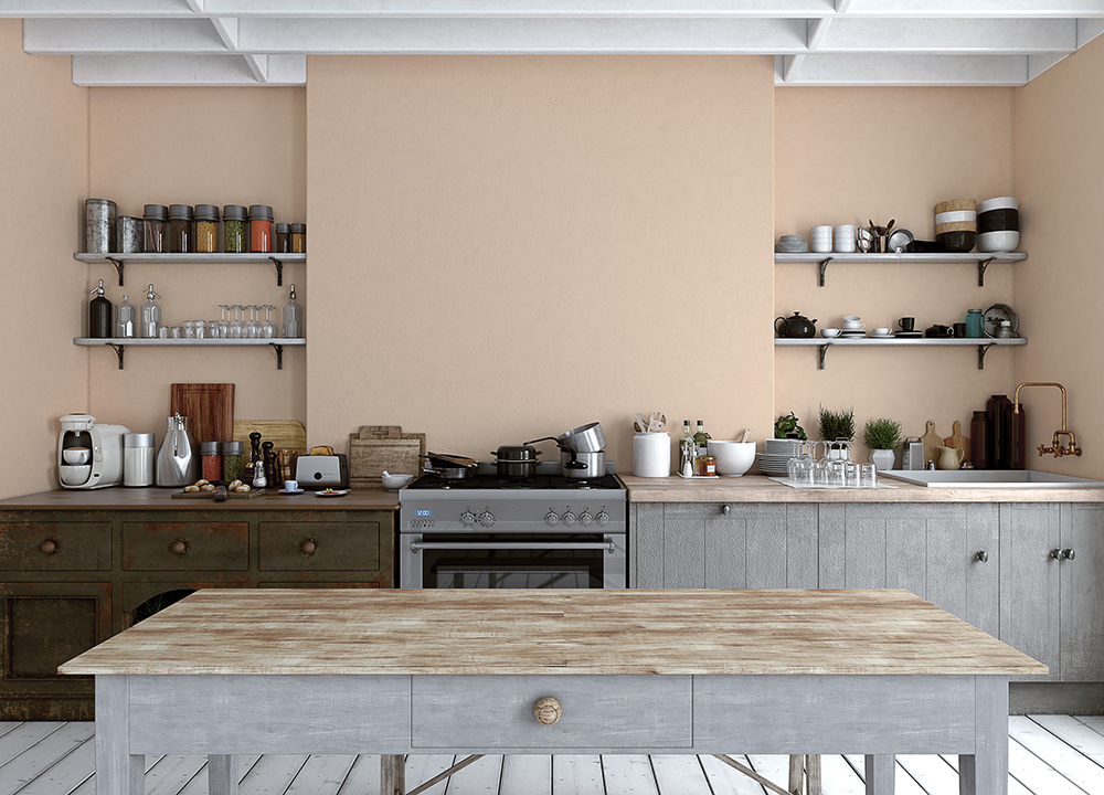
As quick as we are to announce that we’re on to new shades—virtually every major paint company on the planet relishes in declaring a new color of the year—the shade is far from dead; it’s simply evolving.

“When millennial pink was introduced, it wasn’t a new color, but it was a great example of how a large-scale trend blossoms over time,” says Sue Wadden, director of color marketing at Sherwin-Williams.

millennial pink evolution bathroom
Aliaksandra Ivanova/EyeEm/Getty Images

In the mid-2010s, neutrals started warming up, and as a result, blush reemerged on people’s radars. It had been popular in the early ‘80s, Wadden explains, only this version was a bit less saccharine—or, as Hyland put it in 2016, “a non-color that doesn’t commit.” And that’s precisely what made it work so well, both in fashion and ads and—especially—interior design. The chameleon-like color works well with a variety of aesthetics and complements a wide range of colors. That versatility helped its rise and perhaps, the fact that it’s surprisingly flattering. It’s a well-guarded interior design trick to line the inside of lampshades in a pale pink to cast a soft, warm light. “It makes your skin glow,” designer Colleen Bashaw told me in 2014. Like putting on rose-colored glasses, the not-too-pink shade casts everything in a more flattering light. It complements without becoming the focal point of the room.

millennial pink evolution vibes

By 2018, Blush Burnout Began

Somewhere, someone at Pantone is screaming into a pillow any time “millennial pink” is uttered, given the brand deemed rose quartz one of two Colors of the Year in 2016, before decreeing a warmer-toned blush called “pale dogwood” one of the “it” colors of 2017. Millennial pink had better marketing; the term itself was catchy, and it took on a life of its own, becoming so ubiquitous it became passé—even if the color itself didn’t exactly disappear. (It didn’t help that its timing roughly coincided with “basic” becoming people’s go-to insult for someone with overly mainstream, and thus deemed unsophisticated tastes, further prompting people to distance themselves from the term.)

Of course, that’s the rub: The color became so hot, so fast that despite its best efforts, it did become the focal point. In an era where Instagram was the fastest way to market your brand, washing everything—including entire restaurants, floor-to-ceiling—in millennial pink became the fastest way to garner likes (and sales).

Interest in millennial pink, specifically, spiked in June 2017—the summer of frosé, rose gold iPhones and photos of latte art against gleaming marble (or marble Contact paper) backdrops. After that, interest slowly fizzled, with searches jolting upward a tad every spring, according to Google Trends. But then, in September 2021, it started to spike again, before plummeting in December. This year, ever so slowly, searches are creeping back up. (Blush pink, meanwhile, has remained far more popular a term. Ditto for “mauve.”)

millennial pink evolution exterior
Mariana Beltrán/Unsplash

Go Ahead, Call It A Comeback

“When it comes to design choices, millennials are known for turning away from traditional neutral colors like beiges, creams and whites, and often blur the line between what’s considered feminine or masculine on the color wheel. This is where ‘millennial pink’ came into play,” Wadden says.

So, while the name itself isn’t so hot anymore, the range of hues remain a popular choice for warming up a room—and it’s not confined to those born between 1977 and 1995. In fact, Wadden has seen “this hue become a staple in the ‘new neutral’ category for all generations. The use of this color continues to evolve, as homeowners are now gravitating toward more peachy pinks, like Rejuvenate SW 6620, as well as breathy hues like Pink Shadow SW 0070.” (She also cited more terra cotta-inspired tones, such as Rose Tan SW 0069 and Coral Clay SW 9005 as other popular picks).

millennial pink evolution kitchen
Gladiathor/Getty Images

“Blush pinks aren’t going anywhere—expect to continue to see them used as a neutral,” she notes. After all, they’re the secret to making a room feel glowier, cozier and more comforting—something we’ve all been gravitating toward as we enter year three of pandemic life. This iteration (a little less pink, a little more warmth) makes it even more fitting as a neutral. Plus, after years of seeing it everywhere, the shade no longer surprises us. Blush can fade into the background, returning to the goes-with-everything supporting role it was intended to have.

So go ahead, coat your walls in a dusty ballet slipper pink or finally spring for that faded coral-y throw blanket. Because (1) who cares if the name is uncool if you love the color? And (2) it’s time to embrace your basic blush.


candace davison bio

VP of editorial, recipe developer, kitsch-lover

Candace Davison oversees PureWow's food and home content, as well as its franchises, like the PureWow100 review series and the Happy Kid Awards. She’s covered all things lifestyle...