If a picture speaks 1,000 words, we want those words to be of the complimentary variety. So when Lee Eiseman, executive director at the Pantone Color Institute divulges the best and worst colors to wear in photos, you listen.
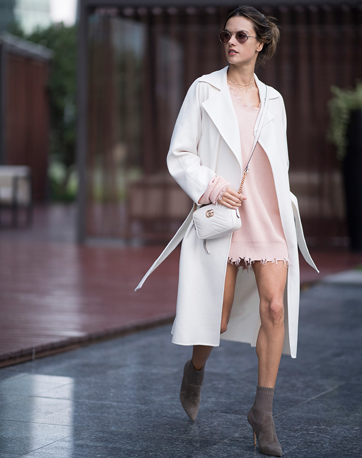
In an interview with Who What Wear, she explained that “very pale pastels and whites can make the subject looked washed-out.” Unfortunately, that means your favorite powder pink top and ecru sweater aren't necessarily the best items to strike a pose in. But there is hope. If you don’t want to give up those sorbet colors for life, she reassures that a little complexion-warming blush can seriously help with the washed-out appearance pastels lend to photos. (Phew.)
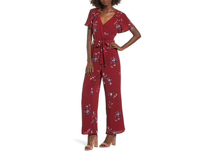
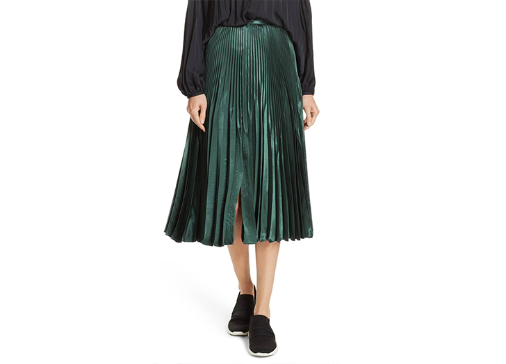
As for colors that always flatter? Eiseman suggests deep reds, teals/turquoises and other shades in the blue-green family. But if you’re more of a neutrals gal, she says, “gray is the best, even better than black.” Well, there you have it.