ComScore

16 Living Room Color Ideas to Suit Every Taste (Seriously)

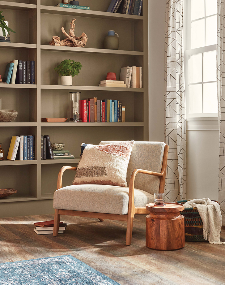
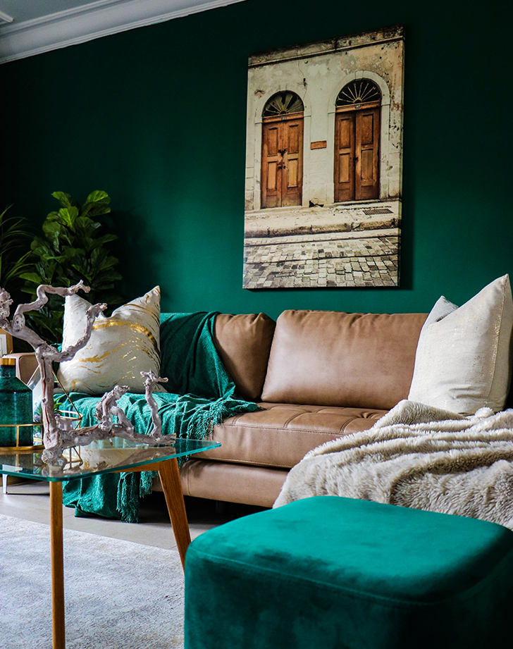
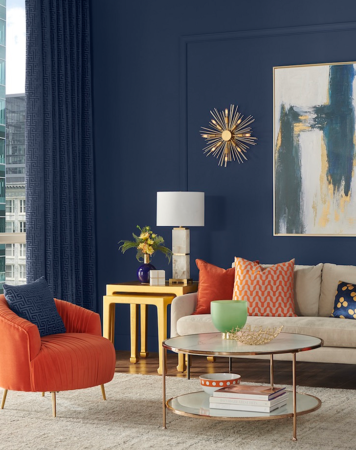
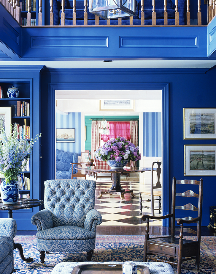
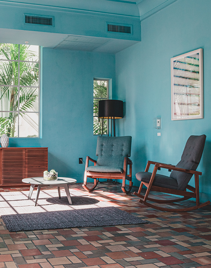
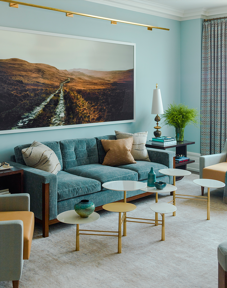
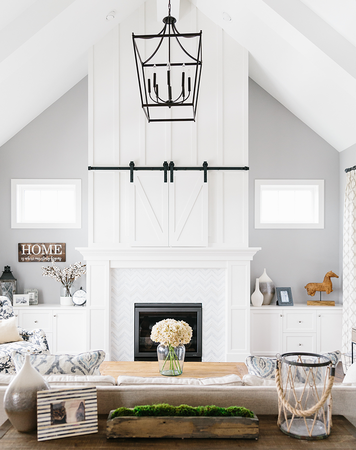
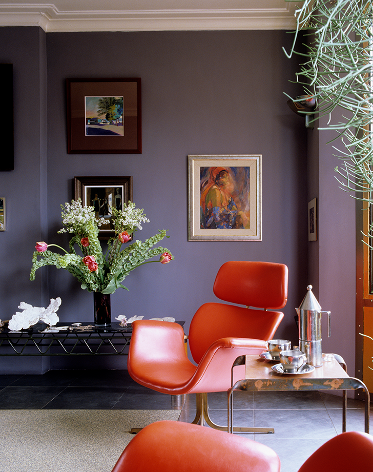
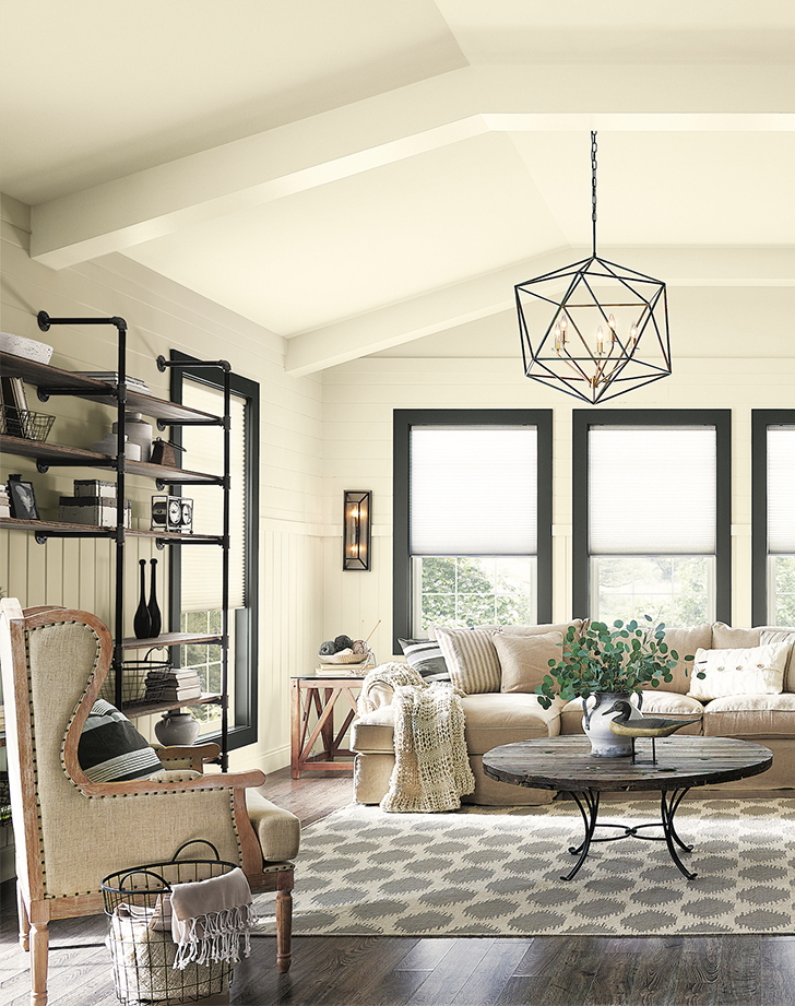
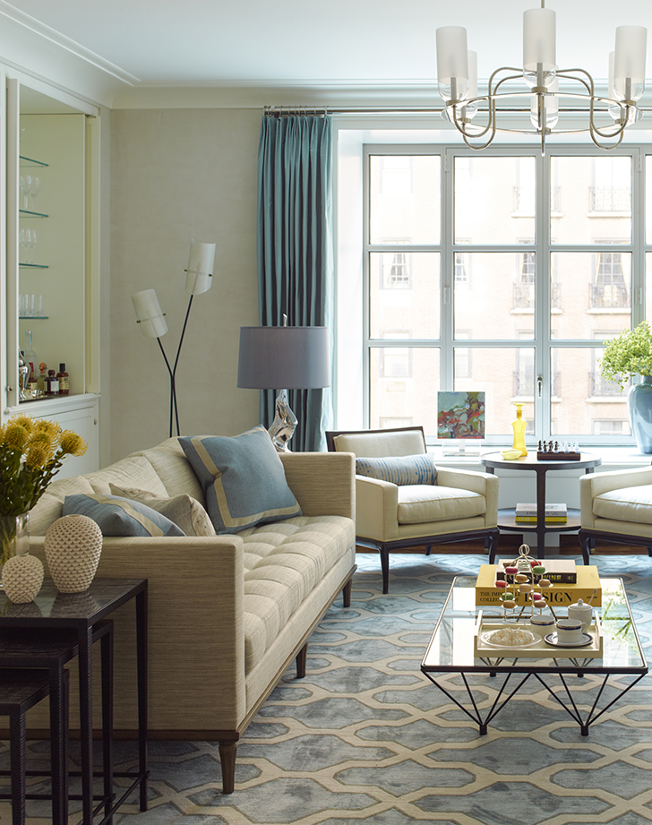
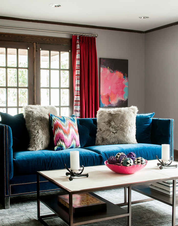
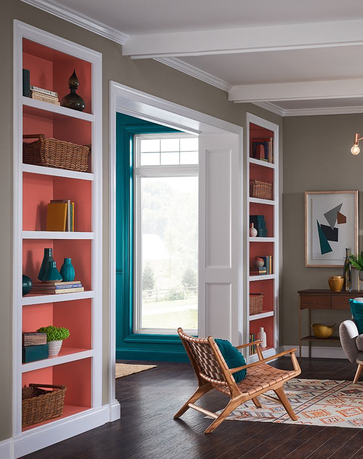
If you’re trying to sell your house, any home stager will tell you that a room should be one of three shades: white, gray or tan. Those shades are represented here, sure, but if you’re not sold—and you want to explore some off-the-beaten-path options to truly make your space feel yours—look no further. These living room color ideas are designed to inspire you.

As you picture them in your house, consider weighing the same factors designer Karen B. Wolf does to find your perfect shade: “We think about how the color works in the room, how it relates to the trim, to the history of the home and how it evokes a feeling,” she says. Once you’ve found your favorite, all that’s left is to pick up your paint essentials (Backdrop conveniently sells everything you need in one kit), so scroll on and get started.

THE #1 PAINTING MISTAKE PEOPLE MAKE, ACCORDING TO JOANNA GAINES


living room color ideas earth tones
Sherwin-Williams

1. earth Tones

Not quite brown, not quite beige—this somewhere-in-between shade, known as Verde Marron, is trending big-time for Sherwin-Williams. “It’s a silky earth tone that’s grounded and cozy, making it perfect for the space that we’re now living, working and relaxing in,” explains Sue Wadden, director of color marketing for the brand. Also popular: warm tones and nature-inspired hues, she says.

living room color ideas emerald
Devon Janse van Rensburg/Unsplash

2. emerald

Now this is a M-O-O-D. Emerald green is the sophisticated take on the nature-inspired color trend. It can go bohemian, art deco, traditional—whatever you’re into—but to keep it from making the room cave-like, work in a few light-colored pieces of furniture and accents, like the rug, throw pillows, and tan leather sofa shown here. Try Benjamin Moore’s Emerald Isle or Behr’s Sparkling Emerald to get the look in your home.

living room color ideas navy
Sherwin-Williams

3. navy

If Emerald feels a little too Wizard of Oz-ian for you, but you still want that cozy, enveloping feel of a dark color, try navy. It’s practically nature’s neutral (think: night sky and the ocean), and pairs just as nicely with light neutrals. Sherwin-Williams’s Naval, shown above, will give you just the look you crave without looking so inky that you have to turn on your phone’s flashlight just to stumble through the room.

living room color ideas classic blue
Pieter Estersohn/Getty Images

4. classic Blue

When we first heard Pantone declared “Classic Blue” the 2020 Color of the Year, we were skeptical. Didn’t it seem a bit…elementary school-ish? Not when you pair it with paler shades of blue and plenty of pattern. In this traditional home, the color makes what could otherwise be a dated room feel fresh.

living room color ideas aqua
Juan Rojas/Unsplash

5. aqua

If you secretly dream of island living—even though your home (and job) are firmly ensconced in the middle of Wisconsin—maybe it’s time to bring a taste of the tropics to your home. We’re not talking going full Margaritaville, but a dose of Bahamian blue, like Lingering Aqua or Tahitian Sky, on your walls can help you feel like you’re made a great escape. Pro tip: Carry that color through to the ceiling if your space is lacking architectural detail and you really want to create a transporting vibe.

living room color ideas sky blue
Eric Piasecki

6. sky Blue

To create a truly mellow backdrop, try sky blue. Gideon Mendelson, founder and creative director of Mendelson Group, loves using Skylight by Farrow and Ball. “It’s a soft blue that feels fresh and clean,” he says. “It's very calming and a nice setting for a monochromatic scheme.”

living room color ideas gray
Mackenzie Merrill

7. cool Gray

To add depth to this white living room, Amy Leferink of Interior Impressions painted the walls in Repose Gray. “What I love about this color is that is a very clean gray that works well with both warm tones and cool tones. It has a very slight blue undertone,” she says. “I would use this color if you have warmer wood tones in the room to balance out the coolness, such as hardwood floors.”

living room color ideas eggplant
Andreas von Einsiedel/Getty Images

8. eggplant

When you’re craving a relaxed shade that isn’t blue (or neutral), look for a grayish purple or eggplant. It’s not as in-your-face as, say, Barney the dinosaur, but it still makes a bold statement. Lobby Scene and Essence of Nightshade and Grown Up Grape from HGTV Home by Sherwin-Williams are all great picks to consider.

living room color ideas plum
Sherwin-Williams

9. plum

If you’re always bumping up the saturation in your Instagram posts, you deserve walls that are equally vibrant. Look for plummy paints with reddish undertones—the room will still feel warm and inviting, but it’s livelier than its more muted cousin, eggplant. (We love Juneberry, shown above.)

living room color ideas sienna
Mint Images/Getty Images

10. sienna

Artists, creatives, people with soul-sucking jobs looking for a room that will energize them: Look no further than sienna. This burnt orange tone can be a lot, but that’s exactly why maximalists tend to love it. Tone it down with plenty of plants and layer on all the art your heart desires because, after all, it’s your living room and you can do what you want with it. Spicy Hue, Negroni and, well, Sienna are all fun shades to try.

living room color ideas tan twist
Andreas von Einsidel/Getty Images

11. tan (with A Twist)

OK, OK, if floor-to-ceiling sienna is just too much for you, consider bringing the color only a third of the way up your walls and coating the rest with a warm neutral, like Natural Tan or Ryokan Guesthouse. You’ll get a jolt of color, and having it run only a third of the way up the walls—with a much lighter shade on top—will make your ceilings seem higher. Even if they aren’t all fancy and thatched, like this one’s.

living room color ideas crisp white
Michael Robinson/Getty Images

12. crisp White

On the other end of the spectrum, you can’t go wrong with a bright, dazzling white. Designers around the world swear by Benjamin Moore’s Decorator’s White for achieving that look. It’s perfect to modernize a space—or for people whose tastes tend to change often. With this shade, you can swap out your art, rug and throw pillows and have an entirely new looking space.

living room color ideas warm white
Sherwin-Williams

13. white With Yellow Undertones

You never knew there could be so many shades of white until you stood in front of the swatch selection at Home Depot, right? Well, if pure white feels too cold to you—or like too much pressure to keep everything pristine—go for white with yellow undertones, like Sherwin-Williams’s Alabaster White. It’s a more relaxed shade that bathes the room in a soft glow, like sunlight streaming through a window on a spring day.

living room color ideas light greige
Eric Piasecki

14. light Greige

Not quite beige, not quite gray, this color is great for adding texture and depth to a room. “It lets the pale blue tones of the room and the pattern on the floor pop,” Mendelson explains, adding, “It makes the architecture of the window the focal point of the room." He used Benjamin Moore’s Ballet White in this New York home.

living room color ideas dark greige
Christian Garibaldi

15. mid-tone Greige

If your room doesn’t get much natural light, consider a mid-tone greige, like Ashley Gray. Wolf used it in the home shown here to “balance the depth of the millwork and to create a calm and cozy space,” she says. “We made it just moody enough to feel like a time-worn library room, but to also feel functional and useful.”

living room color ideas coral
Sherwin-Williams

16. coral

Sherwin-Williams isn’t the only company seeing warmer colors on the rise. Etsy’s seen a 99 percent spike in searches for “sunset art,” particularly anything with a retro, ‘70s vibe. If you’re feeling similarly inspired, consider a pop of bright pink. “For an energizing space, give your eyes (and mind) fun, inspiring elements to focus on. One way to achieve this is by combining multiple paint colors in one space,” Wadden says. “For an easy weekend project, paint the insides of your bookshelves a fun pink that draws the eye and lifts your spirits. I recommend a cheery coral like Quite Coral SW 6614.”


candace davison bio

VP of editorial, recipe developer, kitsch-lover

Candace Davison oversees PureWow's food and home content, as well as its franchises, like the PureWow100 review series and the Happy Kid Awards. She’s covered all things lifestyle...