CHANGES EVERYTHING
Thanks to the Valspar 2016 Colors of the Year and their four original color palettes, giving your home a much-needed makeover is easier than ever. Watch the video to see which color palette speaks to you and then learn how to bring each of them to life.
Click to Explore the Colors
Click to Explore the Colors
Valspar 2016 Colors of the Year Palette
Simply Perfect
Ace: Rocky Shelter
Ind. Retail: Rocky Shelter
Ace: Misty Harbor
Ind. Retail: Misty Harbor
Ace: Tinman
Ind. Retail: Tinman
Ace: Vintage Boots
Ind. Retail: Nature Walk
Ace: Ganymede
Ind. Retail: Ganymede
Ace: Sooty Lashes
Ind. Retail: Sooty Lashes
-
1 / 4
Play with Texture
 Design Tip from
Will Taylor,
Bright.Bazaar“A tonal approach to decorating--using hues from the same color family--provides an opportunity to add depth and warmth to your space,” says Taylor. These schemes work best when layered with texture, like a sheepskin wall hanging, a plush rug or velvet curtains. The elements add interest and help to complete your space.
-
2 / 4
Find a Compromise
 Design Tip from
Matthew Cane,
HomepolishThis neutral color palette takes the guesswork out of accommodating different tastes. “Take this dresser, for example,” says Cane. “The softer gray commands attention, but it’s the darker trim and hardware details that really make it pop. Top the dresser with simple white vases and it’s sure to be a clear tie between masculine and feminine.”
-
3 / 4
Don’t Forget a Clean White
It was easy to settle on an effortless gray for your walls (phew), but there’s nothing more frustrating than spinning your wheels over what shade of white to paint the trim. To make matters easy, Valspar handpicked a coordinated clean white that can be used on everything from the windows to the wainscoting.
-
4 / 4
Can’t Commit? Try This Small Project
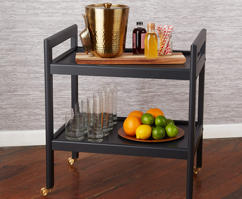
Paint isn’t just about the walls. Take your newfound color palette and apply it to a smaller weekend project like a revamped bar cart. Just choose a Simply Perfect shade of gray, add a few gold wheels and you’ll be ready to, well, roll.
Valspar 2016 Colors of the Year Palette
You Do You
Ace: Piglet
Ind. Retail: Piglet
Ace: Marmalade Magic
Ind. Retail: Marmalade Magic
Ace: Sweet Corn
Ind. Retail: Sweet Corn
Ace: Clean Green
Ind. Retail: Clean Green
Ace: Amazon Drift
Ind. Retail: Amazon Drift
Ace: Blue Jay Crest
Ind. Retail: Blue Jay Crest
-
1 / 4
Expand Your Space
 Design Tip from
Will Taylor,
Bright.Bazaar“Using bold color in an unexpected way will pay big style dividends,” explains Taylor. For example, if you love bright hues but have a small room, have no fear. “Try painting your color, like this uplifting orange, only two-thirds of the way up the wall. Leaving the top third and ceiling in the Valspar coordinating pure white will make the room feel twice the size.”
-
2 / 4
Break the Rules
 Design Tip from
Matthew Cane,
HomepolishNeed a push to try a bold color in your home? Cane has all the rationale you need: “When you were little, did you ever color on the walls? Well, now you’re all grown up and you have your own blank canvas to color whatever shade you fancy. The rules? Zero. Want to paint a wall orange? Do it. Maybe another one yellow? Why not?” The You Do You palette from Valspar lets your creative side shine through, while still making sure the colors flow.
-
3 / 4
Don’t Forget a Pure White
One thing to remember is that the white paint you choose to match a bright color is equally important. For this reason, Valspar handpicked a coordinating white that meshes seamlessly with that blazing-orange wall.
-
4 / 4
Can’t Commit? Try This Small Project
Everyone (we mean, everyone) inherits a set of brown folding tables. To make sure yours don’t look like all the rest, spice them up with a fresh coat of paint. We love the idea of using all the colors in this vibrant palette to create a unique set. They’ll look as good on display as they will topped with a cold glass of lemonade.
Valspar 2016 Colors of the Year Palette
Comfort Zone
Ace: Whole Grain
Ind. Retail: Whole Grain
Ace: Fountain Foam
Ind. Retail: Fountain Foam
Ace: Fuzzy Peach
Ind. Retail: Pouty Pink
Ace: April Rain
Ind. Retail: April Rain
Ace: Poetry in Motion
Ind. Retail: Embarrassed Shadow
Ace: Winter Moss
Ind. Retail: Winter Moss
-
1 / 4
Think Beyond the Living Room
 Design Tip from
Matthew Cane,
Homepolish“After a nine-hour workday, you should come home to a retreat away from all the noise,” says Cane. “Muted hues, like this soft green, will always provide you with that deep-breath feeling.” It’s important to note that this isn’t just for your living room; you can carry this color palette into any space (especially the bedroom).
-
2 / 4
Add Natural Elements
 Design Tip from
Will Taylor,
Bright.Bazaar“Botanical influences are wildly popular this season, and they work particularly well in this softer color scheme,” says Taylor. But truth be told, weekly fresh flower deliveries can be pricey. Instead, get creative and incorporate floral elements in more concrete ways. Taylor advises “adding hand-drawn details to a dresser” or displaying a series of framed fern prints on a gallery wall.
-
3 / 4
Don’t Forget a Chalky White
Instead of staring aimlessly into a sea of white paint chips, look to this coordinated chalky white to go with your new soft-green wall. Anything else will look too stark.
-
4 / 4
Can’t Commit? Try This Small Project
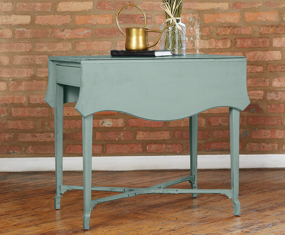
In the spirit of disconnecting, put down your phone this weekend and try refinishing that side table you’ve been meaning to pull out of the garage. All it takes is a little bit of sanding and a fresh coat of paint to turn Grandma’s old nightstand into your new entryway table.
Valspar 2016 Colors of the Year Palette
Good Company
Ace: Deep Pacific
Ind. Retail: Deep Pacific
Ace: Planet Earth
Ind. Retail: Planet Earth
Ace: Stormy Day
Ind. Retail: Stormy Day
Ace: Creole Mustard
Ind. Retail: Creole Mustard
Ace: American Brick
Ind. Retail: Autumn Ivy
Ace: Snug as a Bug
Ind. Retail: Puppy Love
-
1 / 4
Paint Beyond the Walls
 Design Tip from
Will Taylor,
Bright.BazaarDecorating with darker shades such as these works best when there’s a synergy and cohesiveness between all the elements. “Painting your dresser in the same or similar hue as your walls will offer that luxe and modern look,” says Taylor. Not to mention, it’s a lot easier than searching through endless websites for that perfectly color-matched piece of furniture.
-
2 / 4
Play to a Theme
 Design Tip from
Matthew Cane,
Homepolish“When it comes to this rich color palette, it’s best to avoid striking color contrasts,” explains Cane. Bring a vintage feel to the room by choosing leather accents as opposed canvas. “Then tie things together with a series of kilim rugs and gathered accessories.”
-
3 / 4
Don’t Forget a Linen White
Even though you chose to paint your window trim the same color as your walls (how avant-garde of you), the Valspar coordinated linen white can be used for the doorframe, the ceiling or any other accent picture frames. The light color enhances the richness of the other natural tones.
-
4 / 4
Can’t Commit? Try This Small Project
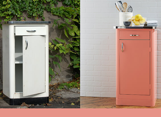
You’ve been meaning to add a bit more storage to your bathroom. Luckily, the vintage-inspired Good Company color palette will work perfectly on that flea-market dresser you just so happened to snag. Pro tip: Opt for brass or gold hardware, rather than silver, to play to an antique aesthetic.


